[SPECIAL MENTIONS]
Let's start with the special mentions! :)) There is no specific order for these but they all deserve praise. I will summarize our critics to be more specific.
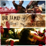
It had to happen by Dytah Dorojin
90% of the entries conveyed for a nostalgic and heartwarming feel. But Dytah Dorojin decided to go for a creepy theme which is quite timely for the upcoming Halloween season. We love Dytah's approach for a scrapbook filled with good memories gone bad and giving the confusion on the maker. Images used in every panel is amazing for it conveys what the scrapbook is supposed to be. The color scheme isn't something to be criticized because of the theme. Typography is nicely done and it is not the usual quotation text used in most cards. Blood brushes are nice as well. Although the white border somehow doesn't go along with the theme. We imagine if it was a different color, the card would be really creepy.
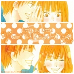
~ I want to {Reach} YOU. ~ by Hanaro Souhi
A sweet and charming entry from Hanaro Souhi. The orange color scheme is amazing because orange means cheerfulness and it goes along with the card. The card depicts the typical lovers scene where the boy whispers something to the girl and makes her happy. Usually, the typography is made in the simplest and plain form. But Hanaro made it look adorable and gives the catchy feeling that really goes along with what the card wants to show us. The white border made such a nice compliment.
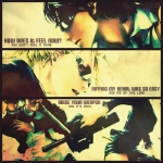
Weapon by Dark Flame 3479
The card has an epic, cinematic and retro atmosphere in it. Its simply amazing! We admire the original cool image and how it was adjusted to retro and vintage color scheme. The images on every frame gives a nice focus and makes it look even more cooler. The small but legit typography is nice (although the one on the third frame is giving us a little confusion).The black border is nice but it could have been another shade of black.
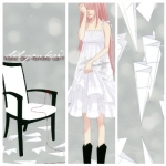
Did You Hear... by Hulaberry32
A card filled with sadness and pain. The color scheme is still the original image and we praise her because the original scheme fits very well. The grey BG gives the neutral feel and we are left to focus on the falling paper planes, the girl and the chair. The white border is a nice touch and the vertical placement is amazing because all the images are shown in their best. A horizontal border might take time for someone to think what is the best cropping of every frame with the original image. The bokeh gave a nice sense of calm feeling and serves as a nice touch as well.
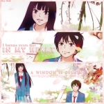
a window is opening... by Blue Latte
A charming entry from Blue Latte. The textured pink border gives a nice touch for the flowery and lovely scan. Nice decision for the pink scheme especially for the typography. Although we see some kind of an unbalance with the typo... Yet, it still is very lovely.