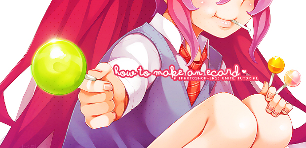
I've only been making eCards on Adobe Photoshop CS5 for about one and a half years now, so I'm pretty much still a noob. Despite that, I thought it'd be fun to create a tutorial like this! I remember when I first started out, I honestly had no clue whatsoever about anything on Photoshop. Everything seemed so confusing! I hope this helps those who feel like I did back then. This is going to be a step-by-step tutorial that's gonna be pretty lengthy. So without further ado, here's my own style of making eCards.
Step 1
ALRIGHTY! First things first: Find yourself a fabulous scan or render to use (refer to the Safe Scan List). Be sure not to use anyone else's art or work (unless you ask for permission or it's your own)!!
Step 2
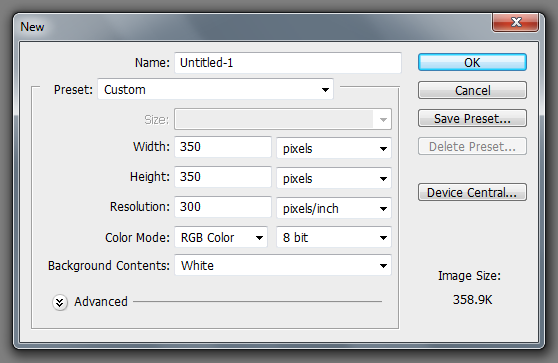
Open up Adobe Photoshop! In this tutorial, I'll be using version CS5. You're going to then go to FILE > OPEN, which is found at the top left corner, to open up your image. After opening that up, go to FILE > NEW... to create a new document. Where it says 'Width', type in "350" then select 'pixels' in the drop-down menu if it's not already selected. Do the same thing for 'Height'. This is going to be our eCard document. Lastly, name the document whatever you want where it says 'Name:'. Click the OK Button.
Step 3
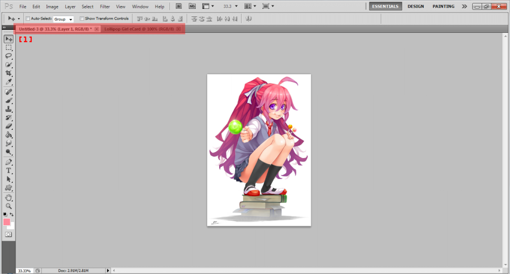
Now that you have a blank document up with the dimensions of a TheOtaku eCard, it's time to add your image. At the top you'll see a dark gray bar [1]. These are tabs you currently have open in Photoshop. Click the one that contains your image. Now, we're going to select the image by going to SELECT > ALL, which is located in the top bar. Now that we have that selected, we need to copy it by going to EDIT > COPY. Go to your eCard document and EDIT > PASTE.
Step 4
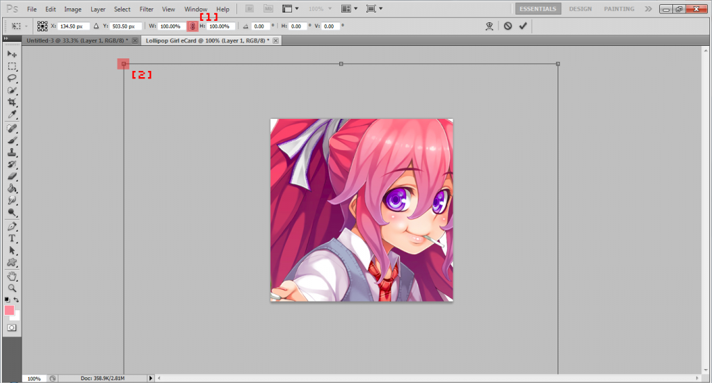
Awesome! But wait. Why is my image too big?! Time to resize it! EDIT > FREE TRANSFORM. Using free transform, you can move your image around and make your image bigger or smaller. To keep it proportional, just click the link button at the top [1], or hold the Shift key while moving the anchors [2].
Step 5
Yay, so we got our image to the size we want it to be. Let's get to actually designing an eCard! But first, I need to explain the importance of layers. Let's open that up: WINDOW > LAYERS. The beauty of layers... how do I explain it? Haha, as awesome as layers are, I cannot stress the importance of them. In order to master Photoshop, you're going to need to use layers. I'm serious about this, you cannot not use layers. Please just use it. Okay back to the subject at hand: Now that we have the Layers window up, you're going to notice two rectangular boxes labeled 'Background' and 'Layer 1'. Next to each label/name, you should see a little box containing your image. Whatever's in the little box is in your layer. We're going to name the one with your image "Image" by double clicking the name, in this case 'Layer 1'.
Step 6
This is where mostly everyone's methods of creating eCards split. Like I said before, each eCard creator's methods of creating eCards are different, and this is my method. Unless you're using a vector, your image may have a few- what I like to call- blemishes. Let's fix that up now, shall we? CTRL + J, then FILTER > BLUR > SURFACE BLUR.... (Pressing the CTRL and J keys at the same time creates a copy of a layer. If you ever forget this quick key, you can always just right click the layer and select Duplicate Layer... then press OK.) In the Surface Blur pop-up window, type in "5" into 'radius' and "7" into 'Threshold'. Depending on your results, you can always change the numbers. Click the OK button. Now we're going to sharpen the image by going to FILTER > SHARPEN > SHARPEN in the topbar. If the result is too sharp, go to EDIT > FADE SHARPEN... and change the opacity (1 being the least and 100 being the most amount). We'll name this layer "Blur & Sharpen".
Step 7
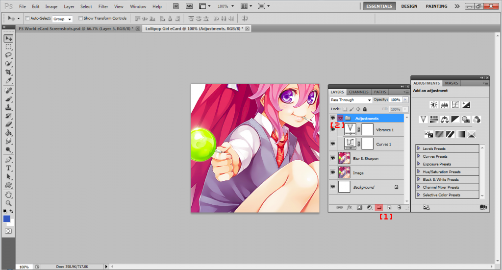
Let's make a few more adjustments to the image. WINDOW > ADJUSTMENTS. With this checked, the Adjustments window should have popped up. (To make room, you can always move these windows around by clicking the black top bar it has and dragging.) Next, we are going to create a folder for our new layers. Click the little folder button at the bottom of the Layers window [1]. Double click 'Group 1' and name it "Adjustments". For this card, I used 'Vibrance' and 'Curves'. Play around with the adjustments and use whichever you prefer!
For organizational purposes, we are going to close the folder by clicking the arrow next to the name [2]. Don't worry, your layers won't delete, the names are just going to disappear until you click the arrow next to the name again.
Step 8
'Kay, now comes my favorite part: TYPOGRAPHY! Choosing what text you'll have on your eCard is challenging. In my book, there are three major categories in typography for eCards: Font, Words, and Color. Each of these is a puzzle piece in which you have to combine together in order to get that feeling of satisfaction for whenever you complete the typography part of your eCard. For eCards, not only do you have to come up with some pretty sweet words, but as well as have a font that corresponds to it that's a color that compliments your image. For example, if your image on your eCard is dark and gloomy with a highlight of red, choose a gloomy or sharp font, with dark colors and a small dash of red in it. Don't use boring fonts (unless it goes with the image, of course), download new ones (check out the Fonts tag)! Be sure that the words you say in your card are meaningful. If you don't know what to say, do what I do: Look up a quote that relates to your image, use song lyrics, or use words from another language (that's always interesting!). Just make sure that your typography has that WOW factor that you like. As long as you're happy and satisfied with it, I'm sure your eCard would turn out freaking brilliant.
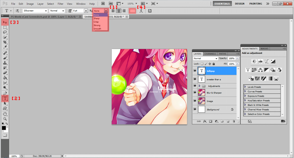
So for this particular eCard I used in this tutorial, I chose the fonts 'Wintermelon' (because it gives off a fun-like feel like the image) and 'Silkscreen'. For pixel fonts like 'Silkscreen', it looks best when its font size is small and its font setting is on 'None' from the drop-down menu at the top [1].
To add text, select the 'Horizontal Type Tool' from the Tool Bar on the left [2], then click and drag to create a text box. Type to add text. To move your text around, make sure that the 'Move Tool' is selected, also shown in the tool bar [3], then drag. To add another text box, create a new layer and repeat the procedure. To change the font color, select the layer in which the text you want to change colors is in (make sure the 'Horizontal Type Tool' is selected!), then highlight the text and click the color box in the top bar [4]. Here you'll find a color wheel/box. Select your color then click the OK button.
Step 9
Most of the time your text is just not going to be visible with the font color you've chosen. But that's okay 'cuz that's what 'Layer Style' is for. To add a layer style, first select the layer which you want to add it onto, then click 'fx' at the bottom of the Layer window. Most of the time, I choose 'Stroke...' or 'Outer Glow...'. For this eCard, I used stroke. Here you can just play around with the layer styles until you get familiar with them. When using layer styles, just be sure the Preview box is checked so you can have a real-time preview of what you're adding and always click the OK button when you're done. If you ever want to add the same layer style to another layer, right click the layer that already has the layer style then select 'Copy Layer Style'. After that, select the layer which you want to copy the layer style to, then right click and select 'Paste Layer Style'. Easy peasy, right?
Step 10
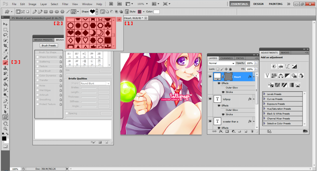
Brush strokes and shapes. Very important things. These can be used to decorate your eCard a bit! Let's say you want to add a heart. Easily done by clicking and holding the rectangle shape in the tool bar and selecting the 'Custom Shape Tool'. Where it says 'Shape:' in the top bar, press the little arrow next to the box, click the other little arrow to the right [1], then click 'All'. Press OK. Then select the shape you want to use [2] and click 'n drag to create it. You can also add layer styles to these!
To use brushes, you first have to open up the Brushes window. That's right, WINDOW > BRUSH. In order to use brushes, you need to make sure you've created a new layer and have selected the 'Brush Tool' from the tool bar [3]. You can download more brushes from outside sources.
Step 11
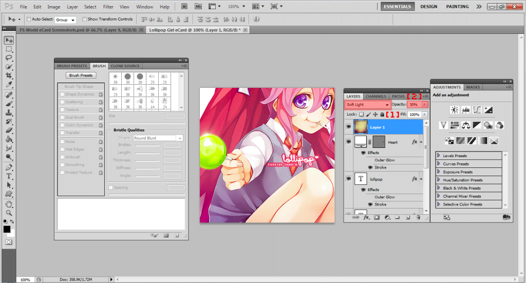
Almost done, time to add those finishing touch-ups. In my case, I decided to use a texture. Textures can be use to add-... well, texture to your image. What else? Here I used my most favorite texture of all and changed it to 'Soft Light' with an opacity of 30%. When adding textures, you'll have to change where it says 'Normal' in the drop-down menu [1], in the Layers window, to whichever suits your image. Experiment with those options and use different textures!
Step 12
Let's add your signature. Don't want anybody claiming your work as there's, now do we? I usually use a nice small pixel font and change it's opacity, or visibility, to a very low number so its barely noticeable. To change opacity, click the arrow next to 'Opacity:' in the Layer window [2] and move the slide bar.
Step 13
FINALLY! You've finished a masterpiece, a beautiful well-made eCard. Applaud yourself and give yourself a pat on the back. As much fun as it is, making an eCard isn't always an easy job. Let's share your work with the rest of theOtaku, okay? FILE > SAVE AS.... When this window pops up, select 'PNG (*.PNG)' from the drop-menu next to 'Format:'. Click the Save button then press OK. And we're done!
That's the end of the tutorial!~ If any of this confuses you or if you have any questions, please ask. Also, if you want to see the finished result of the eCard, click here. Thanks for reading :)
EDIT: Also please check out KairiJun's How to make cards ultimate guide.!!