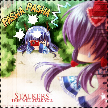
OK, OK, I know I used the same image as in another one of my e-cards, but I just couldn't resist it. It just screamed "make an obviously silly card"!
So, it's basically the same procedure as with the other one, I just changed the text because I thought it looked good as it was and didn't need other enhancements. Please comment, hug and fav, it's greatly appreciated! ![]()


 Stalkers


