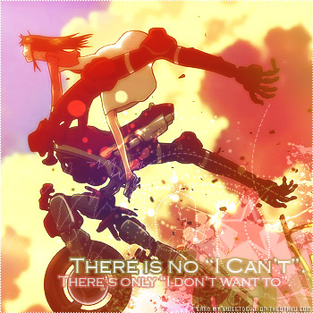
For the Personal Touch challenge ^3^ I had been waiting for a card challenge because I'm too lazy to make a wallpaper or write something (have been in author's block for more than a year now). I hope this qualifies, but I'll explain a bit more just to avoid confusion.
The challenge is based on two things: quality and concept. I admit I've seen a drop in quality among the card submissions, so finding someone who shares the ideal of making good graphics was refreshing :) So, aside from having a high quality submission, the work also had to have a basic idea; mine was never giving up. I know it's become a cliché by now, but it's one of my important beliefs. I've heard a lot of people complain that they can't do something, when they haven't even made a single attempt. Honestly, get over your laziness and try XD You win, good for you; you lose, you gain experience. So, basically, you don't lose. The prizes are just different :)
Now for some tech rants.
Gradients: I used two gradients: green-red and blue-red-yellow, both under Lighten mode, which I'm addicted to <33 I usually use this when making avatars because it's one of my favorite effects.
Brushes: Recently I went through my brushes folder and deleted a lot I don't need. Here, I used some splatter ones, some marching ants ones and starburst ones (lower right corner). I don't remember who made them, but they might be from these places: Endless-Grace.net (couldn't find a link because all I got was Christian and rock sites >_<), Celestial Star, Susan Libertiny, Pootato.
Original image from Random Curiosity
Amazingly though, I haven't texture-whored the hell out of this image :D
Faves, comments and hugs welcome and very appreciated <33
SUPPORT HIGH QUALITY SUBMISSIONS.


 There is no 'I can't'.


