So I met this guy at SDCC '13 this past summer while camping out for the Supernatural panel, and I think I've found my weakness.
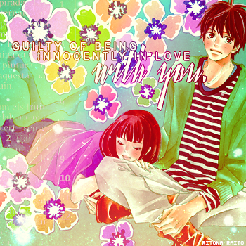
I decided to remake one of my first cards, G u i l t y .. I think this card was actually the first card I ever won a challenge with? Anyway, gah that old card is so bad! I used to be such a brush skank, and I obviously didn't know how to blend them properly.
This card started with the crop, level/color enhancements, gradient layovers, pattern layer set to 'light', dabbed some brushes in the edges of the card, and lastly added the typography (Arial Narrow & Yanty). The card took about 15 minutes to complete, and around 30 minutes to find the scan.
Songs I listened to while designing:
Brighter Than The Sun | I Do | I Won't Give Up | 5 Years Time
** I don't have a direct link to my pattern/texture source. (I download in bulk and often forget the exact place where I get them, especially since they're not named with credit in the download!) :(


 Call Me Guilty


