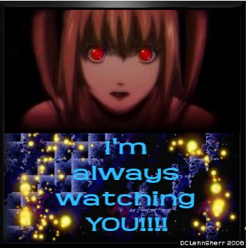
This is the first card I have done using GIMP for everything and it looks odd. I think because I hadn't figured out how to do the shadows behind the text, so everything just looks flat. It doesn't have all the really cool lighting effects of PhotoImpact X3 either so yea ~ Sighs ~ Oh well I liked the background and the sparks around the picture. I don't like the text but redoing everything else just to change the text would be too much of a headache so I have decided to just submit it as it is ~ Nods ~ Hopefully the others with GIMP shall be better!
The screenshot was mine ~ Nods ~
Dranz ![]()


 Watching You!


