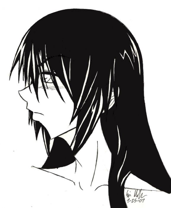
Hmm, well I hadn't drawn Nanashi in ages, so I decided I prolly should, but then it occured to me that his design really didn't fit my style anymore. Problem. So, what else to do but redesign? It wasn't a huge change (mostly tweaks to his hair) but it was still a change. Apologies for the plain-ness of this and the lack of shadowing. The focus of this was mostly on his hair, so that's what I spent all of my time on. Eh, if you want to see what changed, exactly then, um, this would prolly be the best comparison picture: http://fanart.theotaku.com/view.php?action=retrieve&id=92180 Copy and paste it to your browser thingie ^^ Heh, yeah, lookie at the date on that and you'll know just how long it's been since I did a serious piccy of Nanashi >.
Miyoko-chan (Fan Art Portfolio)  Redesign

We now require registration to download high resolution fan art. Please take a few seconds to register absolutely free! Click here now. (Registering will also let you tell this artist how much you enjoy their work in the comments below.)
- Created
- 07/25/07
- Category
- Original Anime and Manga Fan Art
- Tags
- black, nameless, nanashi, original, white
- Views
- 964 views
- Votes
- 8 votes

- Favorited
- 4 members


- Member Dedication
- Everyone
- Feedback
- 2 comments
- Sourced By
- This work is not available for use in other pieces
- Options
Share this
NOW ON INSTAGRAM
Finally! Follow us on Instagram real quick to get some beautiful anime art in your feed 👇


