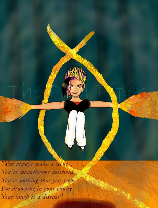
I forget how much I dislike drawing/coloring until I do it. I am pretty happy with that curtain though.![]()
This is for LuminousIceNinja's Character Theme Song challenge. I write everything to music so I thought I'd give it a shot. I was tempted to just enter everything I drew previous to this.![]() By I thought I'd do a character who isn't really a character instead.
By I thought I'd do a character who isn't really a character instead.
This is my space filler, Cald. What's that mean? It means he is insterted into a picture in place of an actual subject. Since I don't do much drawing a lot of my pictures feature Cald the Lavender:
Original Cald
Cald digi-doll by Bobby (base by Wayuki's Place, lousy background by me)
Rixari-esque Cald
Warrior Cald drawn by Sam (colored by me)
--See, he gets decent attention. He also has quite the playlist, 5 or 6 CDs worth. Most seem to be reactions to Cald, but whatever.
I chose Dizzy- Goo Goo Dolls for this picture because the first verse fit so well. Well, I cut out the first and last lines because it fit better without them. Going line by line:
"You always make a scene"
Picture it like this, you're going to go watch some tap dancing at a local studio. Boy comes on stage, taps a verse, then shoots flames from his hands.
"You're monochrome delirious"
He's pretty delirious, and in a single shade type way.
"You're nothing that you seem"
Again, boy shoots flames from his hands.
"I'm drowning in your vanity"
Cald thinks he's pretty cool, heehee. He's either showy or the extreme opposite.
"Your laugh is a disease"
Pyros find it infectious.
About the picture process in general: I drew this a while back when Bobby and me were keeping Sam company. When the contest rolled 'round I decided to enter...then realised I might have access to a scanner when I'm away this semester. So I colored Cald. Cald is refered as "The Lavender" because he always has a lavender hue in his skin, and eyes (digi-doll is the exception). One of the best spots to see that hue in on his left arm near his shoulder.
Cald's hair is black with yellow and purple streaks, natural since he's not human. With all the flames the bulk of his hair looks more yellow. I tried getting the flames reflection off. With this being a showy picture I dressed him in black and white. I do like how his pants came out, with the little shading and orangey highlights. I hate doing flames. The fire looks bad, but I rushed and decided not to go back and fray the edges. As for the background, eh. I drew the thing in gimp. Just real simple so you don't get distracted from the center focus.
And that'll be all from me. I want to try getting into a few more challenges, I'm sure I'll be doodling when I'm stuck on the plane for 20 hours on Sunday. Oh no, power failure! I hope this goes through.


 When Tap Lessons Go Wrong


