Heh I just noticed that the contest almost states this should have been drawn on a beach, alas I didn't think that far ahead.
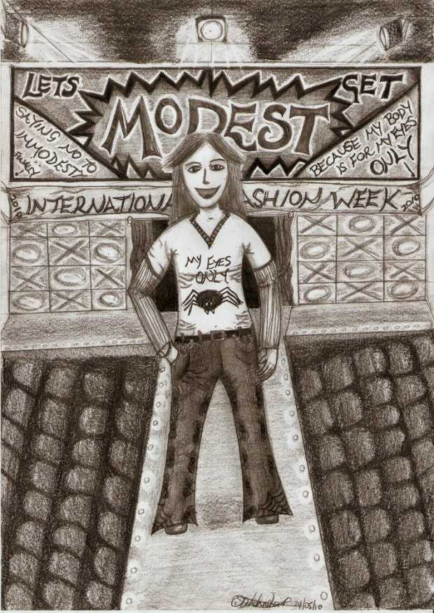
Oh well this was for a contest that said you had to do clothes which cover the body (which is the bit I focused on). I didn't really give much thought to the background except decided I needed one and it ended up being a fashion show for some random reason ~ Laughs ~ I hadn't planned it that way but there you go.
I quite enjoyed drawing this. For one it was a good excuse to sit in the sun and sunbathing/burning as the case may be, and also I rarely ever draw from my mind and with backgrounds, so it was a nice excuse to do both of those, and I have to admit I feel quite proud of the end result.
At a stretch I would say the character featured is called Ezra, purely because of the hair (I drew an Ezra ages ago and she ended up with that hair) and she is modelling a summer design by me ~ cracks up ~ Though as you can see fashion isn't really my thing (as you would see if you looked in my wardrobe) and so pretty much I drew her in normal clothes and coated them in spiders because I like spiders ~ cracks up ~ I think that makes this un-summery but it was still fun to draw and design.
After drawing her I decided to work on the 'modesty' aspect and that was ultimately how I ended up with the background ~ Rolls eyes ~ Also not very summery but I quite like the result. I did cheat by checking out what a fashion runway looked like since my memories of 'America's Next Top Model' were quite vague, but because I drew mostly during the day I couldn't copy so just used it to adjust a few things like the ceiling. Oh and the noughts and crosses are lights, I didn't have a clue what to put there so that became it. It is better than a bare wall at least lol.
My most hated and annoying part were the blasted chairs ~ Eyebrow twitches ~ I spent most time trying to get those right and after various forms including deck chairs and ones kicked over in a stampede I got what I hope looks a little like cinema seats. Overall though I count that as a very crap idea because they were all me and I have no idea what chairs in a fashion show look like ~ Shakes head ~ My favourite bit is the big TV screen behind her and the ceiling above it ~ Nods ~ I love those lights mostly because I like the light effect around them, I barely spent any time on the lights themselves. my other thing are the words which are all about modesty again ~ Smiles ~
So there you have it.
In short this took about err 12-14 hours maybe, definitely longer than normal because of the background and chairs, and is done in a variety of pencils and it is all me so if something is out of the Twilight Zone that is why
Enjoy!
Dranz ![]()
PS: The scale might be slightly off, again that is because the background was added after ~ laughs ~ It is to showcase the fashion ~ Winks ~ Not because I suck at perspective from my imagination LOL


 Modesty


