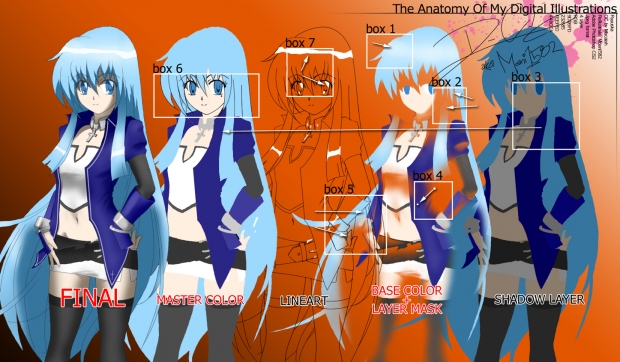
Some people have been wondering how I color my pieces. I can't really explain how just by
words alone, so I created this picture to help explain. This illustration does not teach the process but it shows what elements,tools, and techniques that are involved. My weapon of choice is no other than Adobe Photoshop with a Wacom tablet(highly recommended). I'm not saying that my way of coloring is the best or even great at all, but this is how I do it and there are many other ways out there. Besides, it's all about having fun, right? Ok, Lets go!!!!
First things first: "Ryuuska" is an OC created by Otaku member: "Hikari the Wolf". This is not my character.
Layers:
There are 4 main layers: Highlight,Lineart,Base Color Mask, and Shadow. Every layer should
be in order. The highlight layer sits on the top and the shadow layer at the very bottom.
Boxes: Starting from top middle going clockwise.
1)Base layer has some subtle "highlighting" effects.This layer is the "meat and potatoes" of the color/shading process.It also contains a masking effect within this layer. All you have to do is "erase" parts of this layer in order to "expose" the shadow layer underneath. Remember to manipulate the masking part of this layer and not the actual colors.So that there's no confusion, the base color layer is a duplicate of the Master Color layer.
2)Shading technique 1(top arrow), basically I use the lasso tool to cut out parts of the base layer. It gives the "cell type" shading effect whereas the shading edge is sharp and defined. Shading technique 2(bottom arrow),I use the gradient tool to "paint" a smooth transition from color(opaque) to transparent. Use this technique for large areas where "rubbing" isn't smooth enough or lopsided.
3)Shadow Layer is another duplicate of the Master Color Layer but it's saturated more and darkened compared to master color layer. Saturating the color gives the "wow" factor in the shadows.
4)Rubbing technique: I erase a spot of the layer then use the Smudge/rubbing tool to smear in the direction of the fade. The arrow (top middle) is where the erased spot is, then it's smeared in the direction to give it that "fade to out" look. Use this technique for spot gradient shading in tight areas.
5)Line art has to be clean. I can't stress this enough. It's the ground work for any piece. You can see the two arrows pointing at the different thickness of the line art.
6)The line art in this box is "heavy"(very dark and thick compared to "final"). To compensate, make the line art thinner and adjust the transparency(make it more transparent) to give it that razor blade line look. Outside this box is the master color scheme. It looks weird without the line art.
7)The arrow points at the actual highlight layer(white). I can't separate the layer itself because all you will see are a bunch of white blobs floating.
I hope this helps people. It's good to see inspiring artists progress. We all need help sometimes[even me], that is why I'm sharing this with everyone.
*****
Comments? Questions? Critiques? Concerns? Flames? Hate-mails? Bile? All will be acknowledged....
Thanx for Viewing
-Moani1582


 Digital Anatomy


