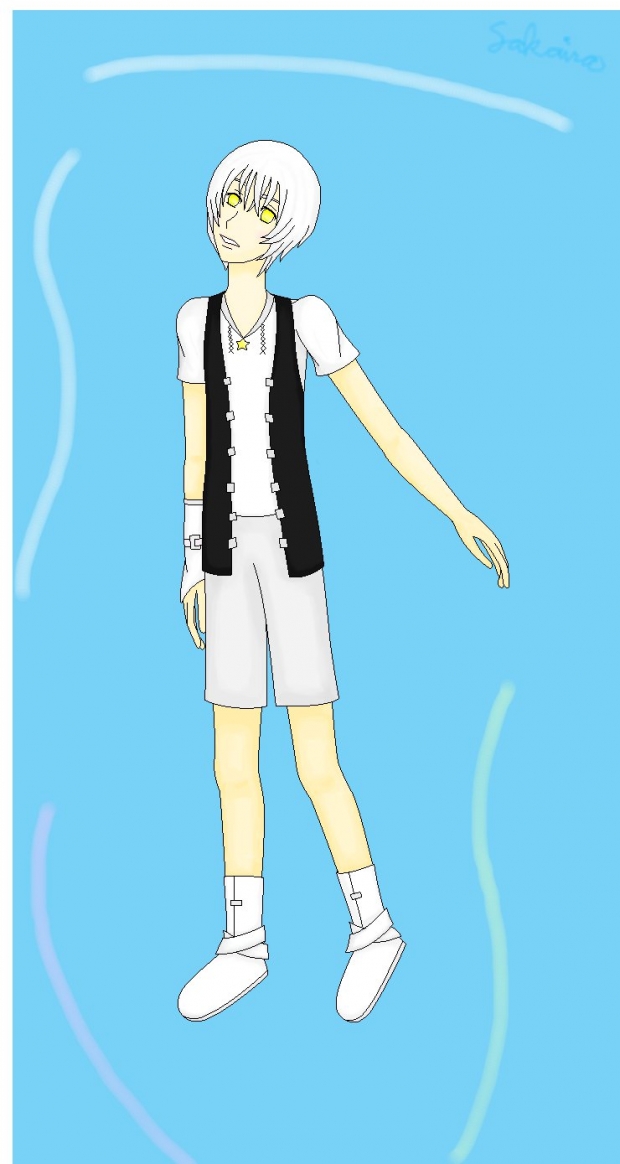
Finally done XD It's badly outlined and colored and very faint shadings... the shadings were more noticeable a few hours ago... huh... Don't ask about the bg or arm cause I have no idea why I even did that... I just need a position for the arm (looks uncomfortable though) and a background that's not white cause its hard to see with all the white I used.
Still looks disproportionate....
I signed my name in the corner XD My penmanship is still ugly with a mouse
Zeal (c) me


 Zeal
Zeal 


