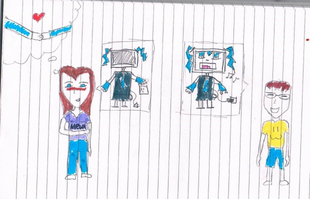
I had a better picture in my head, more anime style. But I'm not good at drawing. That's the only thing I hate about myself.
This is the conversation between the two people:
Boy: why doesn't miku hatsune just use a normal voice instead of autotune?
Girl: maybe they need to unplug her
The list of all the wrong things in this artwork:
-miku was meant to have a COMPUTOR head and a normal human body
-the characters were meant to be more anime style
-the boy was meant to be rubbing the back of his neck (like in animes)
-instead of holding hands, the thought bubble was meant to be of them kissing
-I was meant to do a lot of things but I fail at drawing
I think I'll stick to fanfic, that's what I'm good at.


 Vocaloid Love


