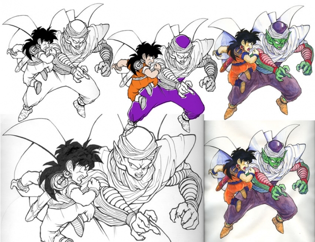
What follows below is a description of the process that I use to create my fanart works. I've dedicated this to MangaKid, who commented and asked what I used to color the work. If I could dedicate it to more than one person - I would! This also goes out to Team Plasma N, who also inquired about my process - and to all other people who may be interested!
~
I happen to be fascinated by the process that works go through, from beginning to completion. This is for everyone else out there who might share my fascination! If I had access to a scanner throughout the entire process for this, I would have done a bit more documentation - I started this with rough pencils.
Phase 1: Rough pencils (not pictured). At one point, I had played with the idea of including a "motion shadow" of where Gohan was, only moments before (he was right where Piccolo is currently grasping with his right hand) - but I eventually scrapped that, as you can see.
Phase 2: Rough Inks. This also is not pictured, sadly. What you see all the way on the left is the final inked version. I start by fleshing out the pencil sketch, using a 01 sized micron pen. After I've got the basic line work down, I continue to work the image...
Phase 3: Finalize inks (shown all the way on the left, and detail lower left - note that the detail is not adjusted for contrast, what a huge different that makes, yeah?). This generally involves going back with a larger micron pen, in this case, a 03 micron - and developing some variation in line weight. This may be my favorite part of the process... line weight variation! This really has a major impact on the work, as a whole. Just using line weight, you can suggest a character's weight, some shadow, and emphasize important aspects of the work, including depth. I definitely need to approach it with a zen attitude, I cannot rush it. This type of work generally comes naturally to me.
Phase 4.1: Pretend that I'll use Photoshop to color the image (pictured at center top, of course). There can be no pretending here - I do not know my way around Photoshop with any real degree of comfort. I simply haven't built up any speakable experience with it. That's generally because I find working on paper to be so much more satisfying, in a tactile sense. I like the feel of paper, and the feel of brushes. Every now and then I pretend that I'll use Photoshop to fully color something, which generally ends up convincing me to pick up a brush, which I did next...
Phase 4.2: Watercolors (pictured lower right). Brush and watercolors! This tends to be my favorite method for coloring line art. With this piece, I didn't do much experimentation - the colors are quite simple, not too deep. This is in part an homage to the relatively simple color palette of the anime, but it also reflects the limitation of the paper I chose to work on. I was not using a watercolor paper - and worse, the paper I chose was quite thin. Essentially, that's the worst thing to do when you're working with water. I tend to work with watercolors on the dry side - so the paper didn't buckle too horrendously. But, really, I cannot recommend to anyone to work this way! Do yourself a favor and use the proper paper. This just happened to be the most convenient paper at the time I started working...
Phase 4.3: Touch-up in Photoshop (final work! Appears in upper right). Due to some of the issues mentioned above, this piece took a bit of touch-up work in Photoshop. This involved cleaning up the paper / background - due to paper buckling, etc., the paper around the characters was initially quite visible. That area was deleted - leaving a very clean looking white background. I ended up needing to edit the fluttering edge of Piccolo's cape because, as it's next to the white background and it theoretically white, it was looking unnaturally yellow and gray after the paper color was mostly deleted. So - that just took a quick bit of adjustment with the colors dialog box. The finished piece can also be viewed by clicking here.
Please don't hesitate to ask me any questions about the process!


 Master & Student Process


