llustration project, editorial again. Unlike last semester, though, I don't have a seething burning hatred of this one. Mild dislike, but not hatred.
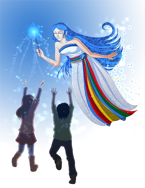
I kid. Well - kinda. I have mixed feelings about this, but I usually do, so...I dunno. The piece here corresponds to an New York Times article called Don’t Be Evil, but Don’t Miss the Train. It deals with, well, Google. Somehow I got a fairy godmother (googmother?) image from it.
There was originally a lot more going on, with like, sparklie blooms at the bottom of her dress, and text warping out of the kids' backs, and all this crazy stuff. I got rid of the dress stuff after an hour of working on it, then got rid of the text the next day in class when consulting with peeps. One click of a circle gradient from our professor and bam. Piece finished.
Of the two editorials, I picked the one people definitely shied away from. Go me, I guess.
Tools: Paint Tool Sai for lines, Photoshop for everything else. 7x9" at print.


 Don't Miss the Tech Fairy


