Hello :) This is my entry for shiroyuuki1 challenge - New Years Resolution
I had set out some objectives for this year; Which can be found here:
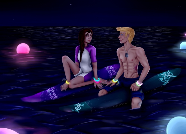
On this piece I think I’ve achieved better anatomy, (on Llew at least, I used a reference and kinda improvised on Hazel, but she came out okay). And I’ve been able to create a decent atmosphere which I’ve struggled in the past, and I think I’ve done okay with the composition, but I’m not sure.
This picture was from an answer to an ask and I really liked the pose and idea, and I thought it was a nice idea to have it set at night and they actually do this in some places (well not in the shark infested areas, given that sharks hunt at night and go for the bright colour/light) Llew likes surfing, he’s pretty happy being in the 24/7 if he could ^^ He and Hazel have been surfing together for years and Llew is the one who taught Hazel how to surf :) and he’s trying to impress Hazel by surfing with no wetsuit, but he wont look so tough when he’s wrapped up in one of Hazel’s fluffy purple jumper XD
I really like how it’s turned out but there are some things I’m unhappy about, like some parts of Llew and that I couldn’t get it look like it was wet or waves and I need to improve on that! I’ve tried really hard on this but I realise that it doesn’t look that I’ve improved, but I have tried! But considering the last time I entered one of shiroyuuki1 challenges with this (entry) I have improved a lot :D
I would really, really, love a critique, I love getting constructive critiques as I want to improve :D There are some things I’m going to change and improve on soon
Llew and Hazel and art work belong to me
Edit as of 10/02/2014; Made the glow and where it hits better, and made the heads slightly smaller.
Edit as of 20/03/2014; (suggested by Deli) I made the sea lighter, lighten the shading on his muscles, flattened the boards.
but I wasn't able to make them look submerged and I did tweek the lighting but there is still a bit to improve
Edit as of 28/04/2014 I've added light to the sea more, made the orbs lights reflect more and added the light where they should hit on Llew and Hazel and their boards and I've finally managed to make them look submerged :D Granted not very well but at least they look submerged :D


 Night Surfing


