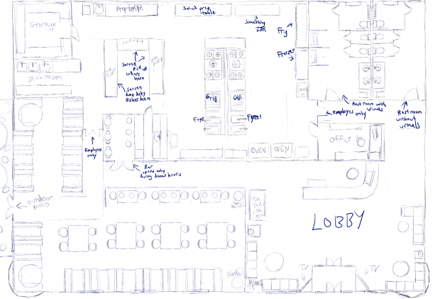
The layout of Porcia's restaurant Poke Delights
God this was so hard! and I was worried it won't fit but it worked out.
So there's a lot of space I know but I wanted it look like there's a lot of room for people on the large size and people who use wheelchairs. And it makes it easier to maneuver the food cart around. But I think theres too much space in the lobby. I'll work on it later.
The double doors on the left side lead to a patio where people can eat outside if they want to. I didn't drew that because I was too tired XD
I also haven't decided on what the outside would look like. The tower windows (forgot what their called) on the left and right side was done last minute.
Artgrrl (Fan Art Portfolio)  Poke Delights Restaurant Layout

We now require registration to download high resolution fan art. Please take a few seconds to register absolutely free! Click here now. (Registering will also let you tell this artist how much you enjoy their work in the comments below.)
- Created
- 11/30/-1
- Category
- Personal Fan Art
- Tags
- building, idk, layout, poke delights
- Views
- 173 views
- Votes
- 11 votes

- Favorited
- 8 members


- Member Dedication
- Everyone
- Feedback
- 4 comments
- Sourced By
- Available to use (but no submissions yet)!
You're allowed to use this piece for your wallpapers and ecards if you: (1) paste this page's URL when you submit them and (2) agree not to upload your new work outside theOtaku.com - Options
Share this
NOW ON INSTAGRAM
Finally! Follow us on Instagram real quick to get some beautiful anime art in your feed 👇


