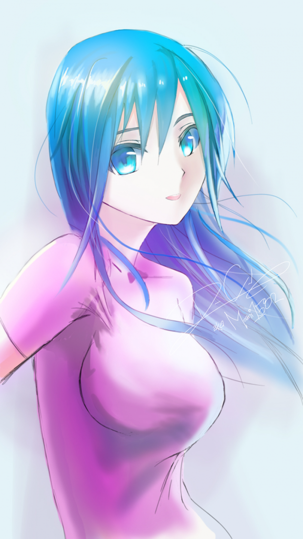
I guess this piece was meant more for the style than anything else.
I'm gearing towards a more "Traditional" look. Yes, I know the head is too big.
Yes, I know the line art is sloppy. Yes, I know most of the shading is bad. Yes, I know the clothing is plain. Those do not matter for this one. My focus was on style, achieved by all different brush strokes. no assisted pen tool. Woohoo!!!! Also I noticed that my art was lacking in body dynamic poses, tried something different. Share your thoughts and write a comment. Also, I'm willing to answer any questions one might have. I also critique as well (constructive only).
P.S. Sorry I don't have a name for her. she is not a character I'm trying to create. Feel Free to give her one. lol.


 more Style less assist


