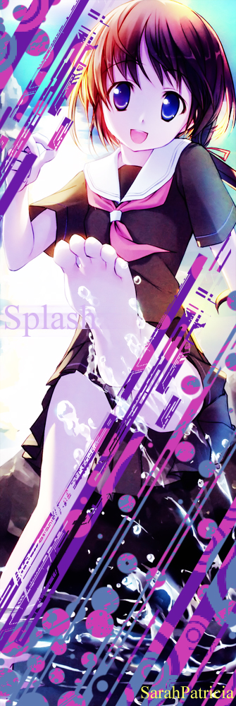
I made a banner/signature in Photo Shop this morning :3
Two versions. One with brushes, and the other, without brushes.

with brushes

without brushes
What I did:
I enhanced colors(burn, dodge, hue & saturation) .Cropped it. Added lighting. Added new colors. Added brushes. Tweaked brightness and contrast. Adjusted curves. Added text. Made a new text layer (the same text (splash)) >Motion blur. I inserted my name :3
So, which is better?
Credits:
Original scan: [minitokyo.net]
Brush: Midnight City by ShiftyJ
Layers: 12
Time: About 30 minutes.