G'afternoon ^^
Sorry I haven't been commenting or updating. I read all your posts and vote'fav stuffz, I just haven't commented. My time's been consumed by another essay [which is all finished, thank God >__<] and other school work. I haven't even had enough time to colour ;____;
BUT, lemme get to the point:
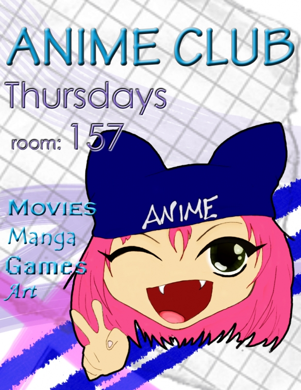
Last year, I created a mascot for my school's anime club and now we need a flyer. So I spent a huge chunk of my Saturday colouring it in with photoshop [the other chunk playing Rock Band XD XD XD].
[I think it came out pretty gooood :D] The flyer's finished but I'm not too sure about how it came out...
So I'd like all your opinions =D [plz!!]
What should I work on or take out? or is it all good?

Added some stuffz:
It lookz kinda pixalated in this pic, but dun pay attention to that ^^
