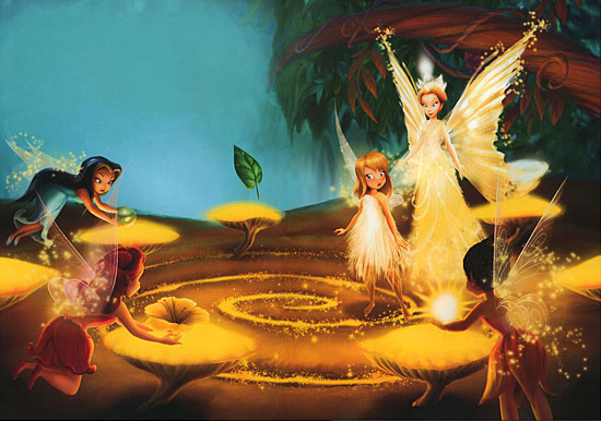
Sorry, I just couldn't keep myself from posting this image, it came out too pretty! Also, this is a great opportunity for y'all to have an idea of how the new books look - I don't know about the others, but this one is absolutely gorgeous. I can't wait to work more on it. And this time I took some screenshots of my progress just because it looked so nice.
Click the thumbnails for bigger images.
First of all, I piece together the two scans. Since there are two pages and my scanner is A4-size, they don't both fit at the same time, so I have to scan them separately. They come out lighter that they actually are. Also, notice all the green, red and blue lines - these are from the scanner and I have to remove them manually (which is most of the work process).
Cleaned the lines and -gasp!- the crease in the middle! It's a first for me, but it was easy since it didn't take up that much space.
Removed the text on the left, but there are still some things to mend...
...such as the small issues with color matching on the left, in place of the text. Had to mix ("paint") the blues a bit to blend them in, because they mostly looked like blocks. And, finally...
The color correction (using Curves only!) and a dash of Smart Sharpen to give it that crisp "scanned image" look. This is approximately how it looks on paper. I also fixed some red lines that had escaped me back when I first hunted them down.
Also, sorry for the (again) huge file size of 6.74 MB, but I saved it at the lowest quality I could. Any more and all that good retouching work would've gone to waste.
What do you think? This goes on for every couple of scans I fix :]


