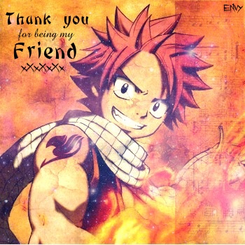
Hi everyone! Call me Envy :D

I really need some help on improving my cards. I don't have any fancy photo-editors/can't use any (Photoshop, GIMP, etc.) so I make all my cards on Fotoflexer (for layers) and Picnik (for editing). Adding text is my largest problem. I can never find any text that looks good, and when I do, I go to save it and it sort of blends in with the image (yeah, I realize the text doesn't look very good with the image D:)
Suggestions?