deviantART: kaidafaye.deviantart.com tumblr Sketchblog: jennidoesart.tumblr.com
Official Website: jennidoesart.com

deviantART: kaidafaye.deviantart.com tumblr Sketchblog: jennidoesart.tumblr.com
Official Website: jennidoesart.com
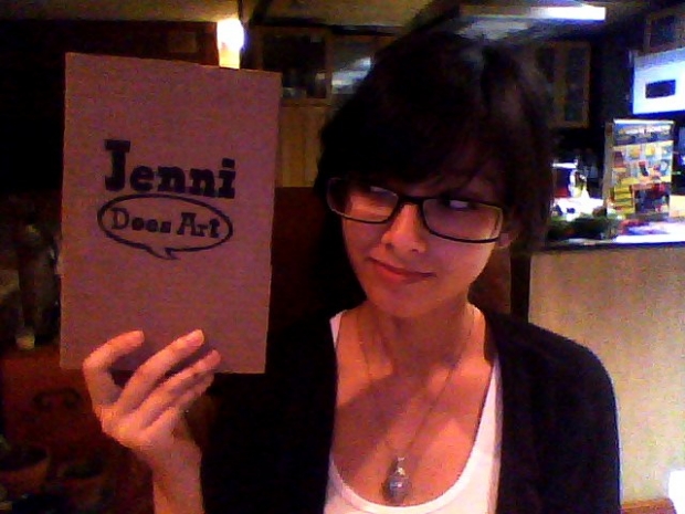
I ran out of room in my other one. This one was much much easier than the one I sewed together with dental floss:
I used one of those handy dandy book binding jigs Gui whipped up for me and used Elmer’s contact cement to perfect bind the pages together (one signature was just one 8.5x11inch sheet folded in half, it works nicely). Then when those were semi-set, I stuck the cardboard cover on with more contact cement on the spine and it’s setting now. Supposedly after an hour it’s all good, but I’ll let it rest overnight before I dive into doodling.
Self promotion on the cover :3 JenniDoesArt.com
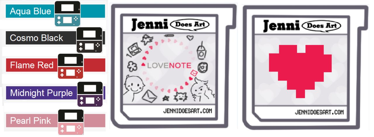
I need to know how many of each colour of the 3DS I should make for artist alley. Here's the poll: http://www.facebook.com/?sk=question&id=277093835725160&post_id=277095299058347&qa_ref=qd
The more people, the more accurate. Please and thank you!
Also, if you're not in the area where Chibi Pa is being held and want to get a hold on my comic LoveNote or any of the cute little keychains/straps I'm making, don't worry! As soon as I finish LoveNote, I will have a shop open and I'll let you know when it's up :)

Hey, look, art! Kind of. But hey, at least it’s something, right?
These are the keychains/charm straps I’ll have at Chibi Pa. The 3DS logos match up with the released colours of the 3DS in the US, so if another colour is up for release before Chibi Pa, I’ll most likely add it in to keep it accurate (I think they’re gonna at the Ice White one next, it’s in Japan right now). Not too many people have the pink one, so I won’t make as many of those.
I had a lot of fun designing the LoveNote game card! I was trying to tweak “Jenni Does Art” into the Nintendo 3DS logo, but it didn’t look right. So I used my regular logo instead, and I feel it fits pretty well. Then my URL is in the bottom where the numbers usually are, I tried to use a font that mimicked that font to make it blend in more.
I’m not too fond of the unoriginal, way-too-overdone-but-still-popular pixelated heart, so unless anyone shouts out HEY KEEP IT, then I won’t be making it.
These won’t be those thin laminated paper charms, I always felt like those were a bit cheaply done. I understand that there’s really nice laminate out there, but it looks less professional and I always feel bad when I don’t buy one that I liked the art of. I found this nice tutorial online to make really nice, high-quality charms using a special Shrinky Dink paper that you print out from your computer instead of colouring in(which I also thought looked too childish), and then coating it with a special waterproof seal that you melt down on top. They look so good that you’d think you bought them in a store! Check it out: http://www.sillybeeschickadees.com/2010/09/shrink-dink-doo.html
So, should the pixelated heart stay or go?
Still working! But check out these badass gamer douchebags. I think I nailed it. Thumbs up for the one on steroids! :D
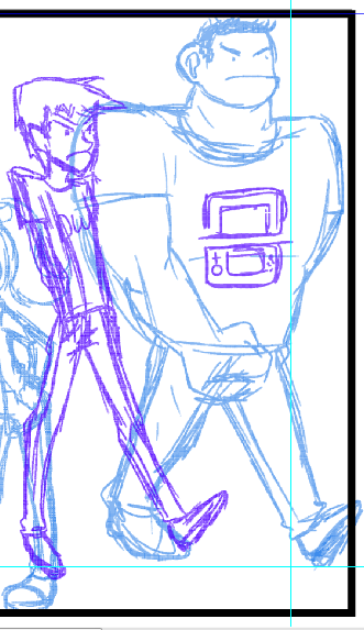
Since it's not completed and there's 2 forms, I decided to upload this sketch in a post. Sketched this last night when I should’ve been sleeping. Then I added some colour just for reference for when I ink it and colour it for real. I wanted their outfits to resemble their Mii’s. What do you think?