THIS POST IS ABOUT ART THINGS, IF YOU COULDN'T TELL BY THE TITLE
Today we started using paint and therefore color in Illustration II. I was nervous as all get-out, having not touched acrylic paint since sophomore year of high school and even then for a completely different purpose. I really, honestly, had no idea what to do. Also, good acrylic paint is expensive. So not only was I now worrying about my technique, I was worried about trying my best to not screw up too terribly.
I took oil painting last semeter. I know how to paint…with oils. Luckily, we’re doing flat color, so…cel-shading. EXTREEEEME CEL-SHADING

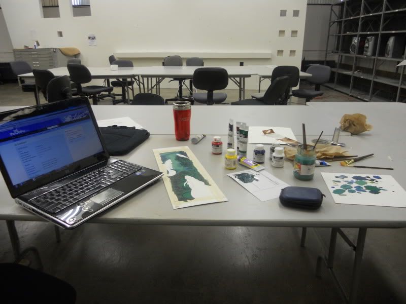
Derp a lerp, my work space. I stuck around for a long while after class let out.

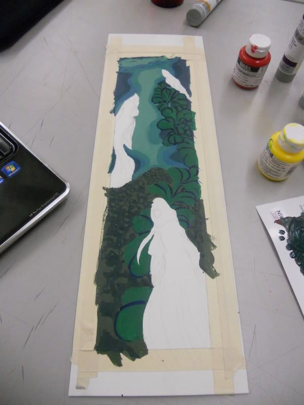
First shot of what I had down. While this project was intended to be a colored version of this one, my prof pointed out that my main issue was that the ink one was more design-like. I decided it would be better to do a complete overhaul while keeping to the central theme of betta fish.

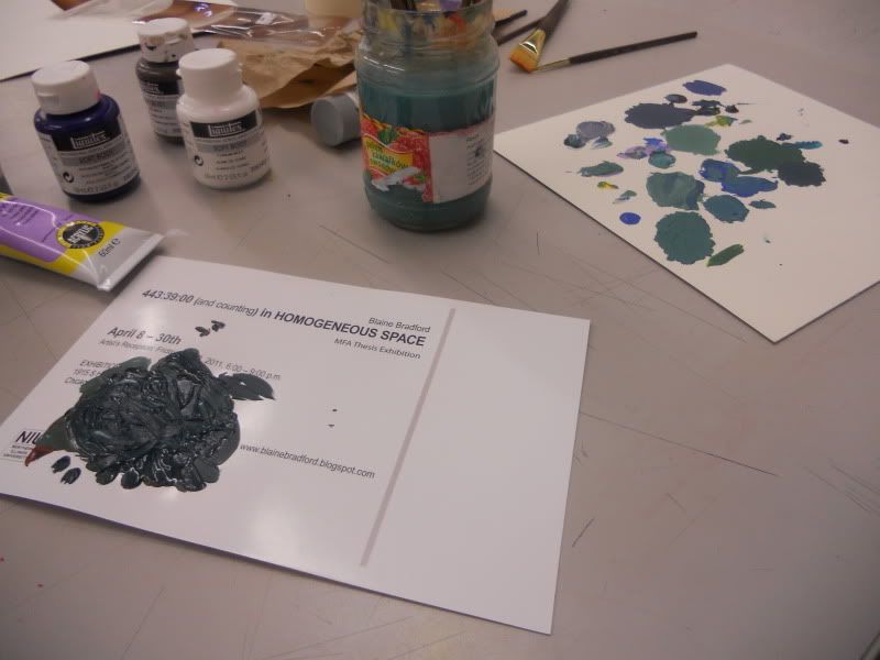
Palettes brought to you by scrap pieces and my 2D professor, thank you! Take note of HOW MUCH GREEN IS ON THERE OMFG. And I mixed pretty much all of it from green, cerulean, ultramarine, yellow, lilac, and raw umber. Nothing straight from the tube is on that project, nosiree!

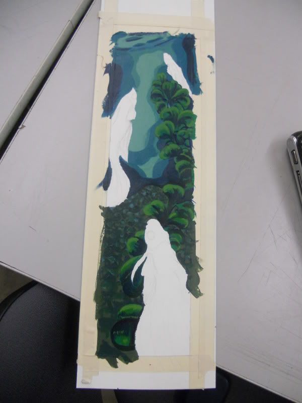
And after a bit more work it looked like this.
I is excited! I forsee myself getting way too into this and wanting to tweak ever minor thing, but meh. Worse things could happen.