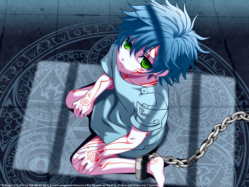
Title: Chained, Heart and Soul
Series: Wand of Fortune [Visual Novel]
Character: Est Rinaudo
Layers: 931
Favorite/Comment @ MiniTokyo and/or AnimePapers
After only see the images for this visual novel I’m crying inside because I can’t play it (don’t know Japanese). I think I’ma start trying to memorize characters so I can at least read… but it’ll still take awhile. *SIGH~* Maybe I’ll get lucky and translators will realize how awesome and much needed translation this VN needs =DDD (hey, a girl can dream! Haha)
So let’s break this wallpaper doooooown~! From Head to toes ;D
1. Hair – I didn’t really do much to this besides gradient overlay. Otherwise the hair is basically the same (with maaaybe a slight color different cuz colors tend to change when vectoring haha)
2. Face – so at this point I realized that the whole wallpaper had a blue tent from (what I assume) is moonlight coming through the window and shinning down on Est. I considered doing “normal” colors and adding a tent afterwards… but decided to just vector color for color and see how it turns out. So even though his skin color is PURPLE it looks alrighty once ya add the shine xD The red marks were actually pretty fun cuz they all have sharp points and turns which makes them easy to vector. Changing the color as the light changes was fun too and made it look even better! ^-^ Yay~!
3. Eyes – I always have fun with these, but Est’s were very… plain (technically, just two solid colors). I understand the effect his eyes are supposed to be (lifeless, not hopeful, given up, semi-dead) so I tried to add a bit of “spice” while keeping with the theme (wouldn’t do to have his eyes look all HAPPY when he’s stuck in CHAINS). Ended up just adding more colors for the color transition… but it made a world of difference! =D
4. Clothes – simple and to the point, I just vectored as I saw. Color might’ve been fixed a bit but basically kept to the original… The letters for his name were a bit of a pain on the “t” to make it look like a “t” but small and following the font style of the other two… annoying! XDDD I did notice the… seemliness near the name, but I’m going to leave them out just because they looked a bit out of place with the rest of the clothes not having any.
5. Arms/Legs – again, stayed with the same color scheme as the face/neck and the same red/shades of red. For the reds, I basically did all the reds then started duplicating layers, adding vector nodes and deleting others so that only the shadow area (if on a shine part) was still vectored and changed the color to shade. Stuff like that made the number of layers I have shoot up (I still stuck with keeping number of layers down… hahahah)
6. Chain – seriously… the chain… uuuuugh! It actually came out really good, but it was time consuming and annoying just cuz I literally did the chains line by line… meaning I have a different vector layer for EACH line of the chains x___X how crazy is that? (toldja I have bad layer management ahah).
7. Dark Shadow – the one ya see around the arms, legs, and chain. Just made it pretty dark and a multiply layer so it is semitransparent, but so dark it might be hard to tell… I dun mind though haha
8. The Background… - yes, this is where I spent majority of my time… the actual vector of Est I finished on 2/5/12 at 4:30am. But, as you can see, it took me a bit more time on the background. (In the BG’s defense, exams and stuff also got in the way pretty badly). Started with some basic lines around circles and the cool pattern in between them and stuff. Did the inner most designs of the circles on the left and went on to finding a font that’d work for those smaller lines that aren’t even readable in the original image. Found a font (credit at bottom) and went right into applying it to those smaller areas which saved me probably a few hours vectoring letters and symbols I couldn’t see… lmao. Then worked on the fire circle’s extra details (top left) before attempting the wind circle (bottom left) and finally just jumping around. *SIGH* basically just a lot of time and work. SOOO WORTH IT, but doesn’t discount the effort and dedication I put into this. Order basically went fire > wind > water > earth for getting done xD Then came the outer most ring with its characters as well. Followed by making the lines/cracks in the floor (with those random darker spots where the floor is chipped or something). Using PSP8 I added texture to the floor and then made the layer transparent so it wasn’t so…striking o__O;; That baaaasically completed the rough version of the wallpaper. Now time to get serious and blend! Haha
9. Blending Everything – this wasn’t hard and only took about two hours to do, actually. That surprised me, but it turned out for the best. Though I worry I might’ve overdone it… I think it looks much better. My favorite part of the blending is actually the shine on his face and how it both softens his face and makes it look like it’s light (as it should be) glowing on his face =D Basically I blended everything except lines and his eyes… I’m was unsure how I wanted to do the eyes, but I decided to leave them raw especially since you can’t even really tell they’re just layer on layer. I moved the texture up so that it was on top of all the runes (I realized if I made the runes transparent, the overlap parts would standout). Oh I also just adore how the chain turned out once it was blended. Honestly, besides the face, I think it’s the best blend ^-^
10. Last Touches – So for the finishing touches, I clarified and then highlight/shadow enhanced the wallpaper in PSP8. The turnout was rather nice if I do say so myself ^__^ hehe
Credits:
Original Scan UPDATED
AA-Hansika. Font – dafont.com
Photoshop CS3
Paintshop Pro 8


 Chained, Heart and Soul


