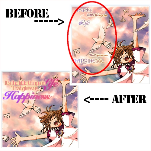
In the above picture, I took someone's e-card (with their permission). They had asked about how they could improve their e-cards and my next few posts will be on tips to improving them.
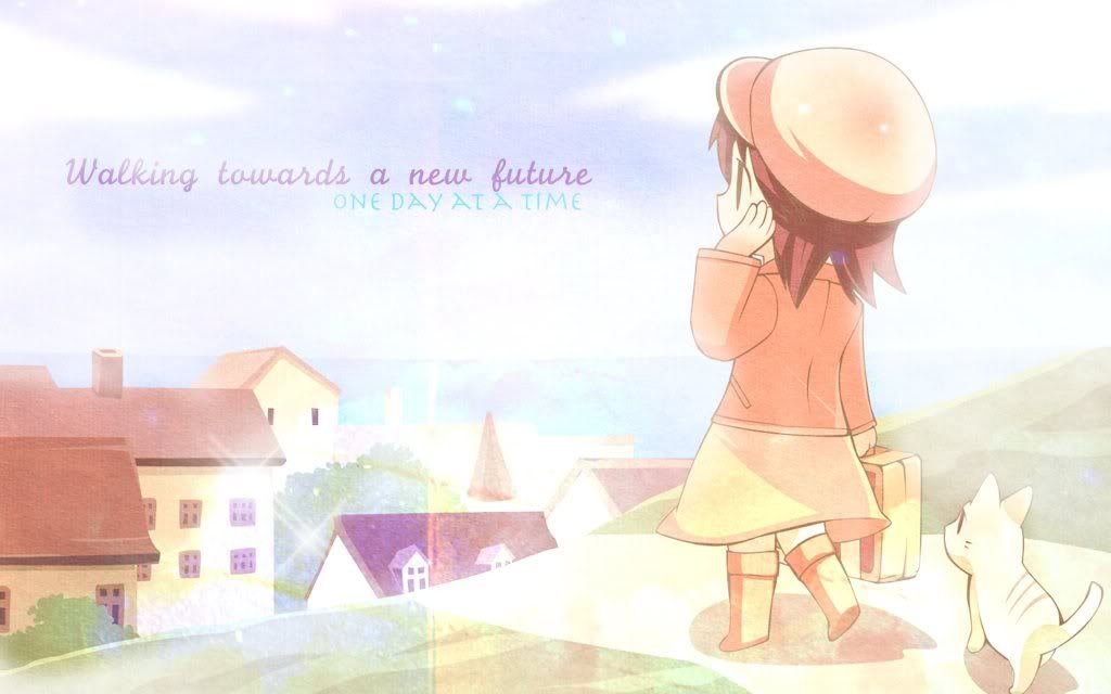
For this one, the scan is beautiful, and the color and typography of the words are great. The only thing? Try less spacing for the words. Put all the words together as shown in the bottom picture. This way, the person who receives the card can see the message without having to move the eyes too much. It's also easier to focus on the different parts of the picture.
Stay away from separating words that much. Keep them all together. It's best if you use them to form a sort of rectangle.
Quick overview:
[x] Don't space out the words on an e-card too much.
[x] Have the words form a sort of rectangle.
Alright, so I've covered most of the basics for wallpapers and e-cards. Maybe one more tutorial for e-card. Other than that, I'm running out of ideas on what people may need tutorials on.
So, if you need any help on anything, no matter how stupid it may seem, feel free to post a comment asking for help! You can ask anything from how to determine a text's size to how to choose a color scheme. Mmhm. If you don't ask, I'll never know! So, ask away!!
So how do people change the whole texture of their wallpapers or e-cards? They use certain images to create textures. So what kinds of images create textures? What kinds of textures should you use?
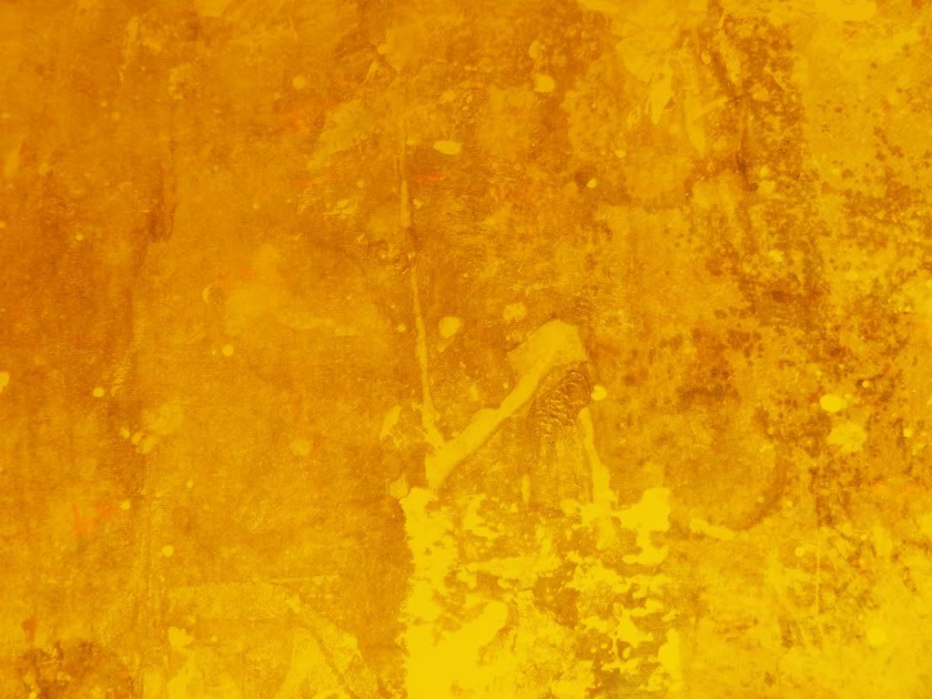
Above, I've included one example of a texture. A texture can cause changes to the light and color of a scan. They can also cause a scan to look older, shinier, and more. They are what make each wallpaper/e-card look better than their scans.
Remember the previous post on layers? That's what textures use. First, go on google or devianart and type in what kind of texture you'd like. Are you making a sad card? Search up textures like "old paper", "grunge", etc. Are you making a happier one? Search up things like "bright texture". You can also search up certain shapes for your scan or color such as "red texture", "butterfly texture", "blurry texture", etc. Save them as images.
Go back to your program whether it is GIMP, Photoshop, or whatever. When you've finished choosing what part of the scan you'd like to use, add the image/texture you'd just saved as an image and open it up as a new layer. From there, you can choose effects from the layer. My favorites are "overlay" and "screen", but play around with it until you find a perfect one. (I believe there's different ways to find these buttons for different programs, so if you need help looking for these functions, look it up on Google)
Sometimes, you won't be able to find the perfect texture right away. That's fine. Look at other people's wallpapers. Sometimes, they contain links to where they got their textures from. You can save those and use them later on. As long as the image doesn't have actual drawings on them, and is just like a little design, you can use the image as a texture. I recommend also keeping a folder in your computer marked as "textures" where you can store all these images.
Have fun!
Quick overview:
[x] Textures can be found on Google and devianart.
[x] Just save the "texture" as an image, and use functions such as "screen" and "overlay".
[x] As long as it is a design of some sort, the picture can be used as a texture.
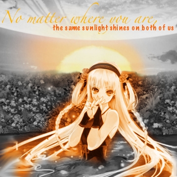
[The above image is an e-card I had worked on, but then dropped 'cause it looked a bit ugly. :P]
One of the most important things to know about for wallpapers and e-cards is layers.
How do layers work?
My favorite way to explain this is to imagine each layer as a sheet of plastic. When you draw different things on each plastic sheet and place them above each other, some parts can be seen, and others can't, right? There's some parts that are transparent, which allows you to see what's below it. That's the same as how layers work.
Layers for wallpapers and e-cards are used for many purposes. It's used to create the texture, to edit the picture, to crop one picture and place it on top of another, etc. When making a wallpaper, one may use up to 20 or more layers (depending on how complicated the wallpaper is). When making an e-card, it usually takes maximum of about 10 layers, unless if you're putting together many images onto 1 e-card. In the above e-card example, because I edited it a lot, it used about 11 layers.
Ok, so you may be wondering why I made this tutorial although it doesn't show the use of layers. It's just to get you to understand the basics before I go off to spinning about textures, cropping, and whatnot. You may get lost if you do not fully understand how layers work. :D
Quick overview:
[x] Layers work like plastic sheets of paper.
[x] Layers are important to create textures, edit a picture, or to crop and place one picture onto another.
So, this tutorial is on the text of a wallpaper!
Now, there are many parts to the text on a wallpaper. How do you choose the words? How do you get it to match with the wallpaper's picture? How can you let the words be seen clearly?
I'll start off with choosing words. Look at your image. What kinds of themes match with it? Friendship? Bravery? Loneliness? Wishful? Once you've got one, you can go onto google, type in "__(theme)__ quotes". You can choose a quote from there. If you don't want to use a quote and instead use your own words, you can think of them yourself or try to tell a short story within 2 lines. For example, if it's on bravery, it can be like "Sword lifted high, standing strong. I stand for my country, I stand for myself." Think of it like a short poem.
Then, matching the text to the image. Is your image one that looks graceful? Choose a font that's not too loopy and looks like simple calligraphy. Is your image one that's showing war? I'd suggest the font "Cracked" if you have it. Match the font to the image's personality. It'll make the text look like it matches. NEVER use fonts that you'd use to write essays. You're creating a piece of art- not an essay. In other words, don't use fonts like "Times New Roman" or similar ones. If your wallpaper's theme is somehow related to strength, I suggest having at least some part of the text be bolded.
How to choose the color of the text? Think of your wallpaper's color scheme. If it's a dark shade of a color, choose a light shade of that same color (or white). If it's a light shade of a color, choose a dark shade of that color. Let's say your image has many colors. Just choose one from the whole mix. You can make it darker or lighter, depending on what I said above. It can be hard to be seen, but that can easily be fixed with a rectangular box behind the text or having an outline around the text (there will be a future tutorial on how to do this. for now, refer to my other wallpapers to see how it looks like).
*Note: If you're making a box behind the text, have it be a bit faint in color, or fade out for if you don't, that box will attract a person's attention instead of the wallpaper overall.
Another great way of learning texts is to observe how other people mix two or more fonts together on one wallpaper. I do this often and it creates a cool effect. Overlapping texts is also a common technique. If you do this though, the text in the back must be bolder, larger, and of a darker color than the text in front.
Quick summary:
[x] When choosing words, you can search up quotes on Google or think up of a short story in the format of 2 lines, poem styled.
[x] When matching text to the image, have it fit the personality of whatever is going on in the image. Don't let the text be too big. The amount of attention attracted to the text should equal the amount of attention attracted to the image.
[x] Have the color match at least one color in the image. To make the text easier to be seen, have an outline around the text or a thin box behind the text.
[x] Observe other wallpaper's technique of combining 2 or more fonts on one wallpaper. It'll help increase your skill.