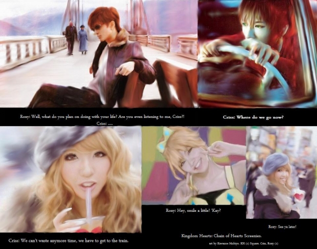
YESH! this took me over 2 months to finish adn it is still crappy! anyway, this is a really awesome/crappy set of screens from my kh: coh manga if it were a game. well, here are notes on each one:
Criss(top left): this was really dumb. it was supposed to be him looking dirty adn bored while Roxy lectures on. He supposed to look bored. The bg was done with lots of colors, gradent and texture tools then blurred at different rates in different areas. The two in teh bg are roxy's adopted parents btw. HE is done with gradents adn hundreds of different shades. softened with smudge tool.
Criss(top right): done the same as the top. the car was very carefully reffed. i had to resize it so it came out a little pixley and yea his eyes got really smudged.
Roxy(bottom left): hate it, don't wanna talk about it. just crappy done with lots of gradents and heavy reffing on hair to get texture.
Roxy(middle): the bets is really fun to do. That is her new power up outfit called DiamonAlice. I'll do a reference for it. she's sooo cute. I luved her hair in this one.
Roxy(bottom right): Came out horrible. I tried to blurr the bg that was really awesomely detailed when I drew it but it got messed up adn then her right eye came out super sharp adn her left was blurred up. the cup of juice she had pretty much dissapeared minus the heart on it. grrr. it just sucks.
I'm working on a better one but tell me what you think. I'll take CGI request but so yaoi and you have to give me more time for couples pictures. 'kay?


 Screenies 4 Kingdom Hearts: chain of hearts


