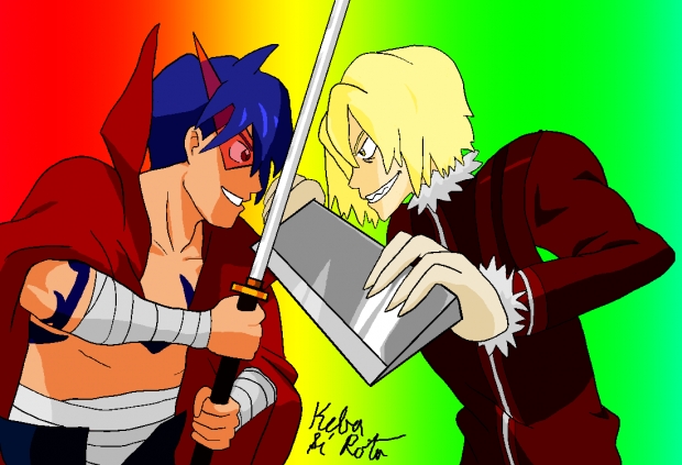
This is for the "In Your Own Style" Challenge. Whew, made it in time. Since I couldn't find a good screenshot of that sword fight in the 3rd episode of Gurren Lagann, I used a scan instead Here's the original to compare.
What's different: Kamina's and Viral's chronic cases of "flounder mouth" have been cured in my drawing. I'm also lazy in that I usually omit fingernails from the characters I draw. I just can't add them without making the fingers looking cluttered. Other differences include the exclusion of all the characters in the background, and the fact that my drawing looks way less action-y than the real thing. WHY DON'T I NOTICE THESE THINGS BEFORE I START SHADING?!
I'd like some tips on coloring digital art. For the shading, what I did was copy the layers with the colors, merge the copied layers, switch the blending mode to "Multiply", and erase the places where shading wasn't needed. I thought it was a clever process until I noticed how flat and digital-y it looked. Maybe it's because I used the preset colors. I see some of you do amazing things with color and shading in digital art, and I'd like to know what you do-- especially for things like metal. I use Manga Studio, by the way.
Speaking of which...
Tools used
- Sketch paper
- Pencil
- Eraser
- Ruler
- Manga Studio 5
- Tablet
The artwork belongs to me, but you can use it in Wallpapers and eCards.
Special shout-out to everyone who saw the livestream! Thanks for stopping by.


 Fighting Spirit!


