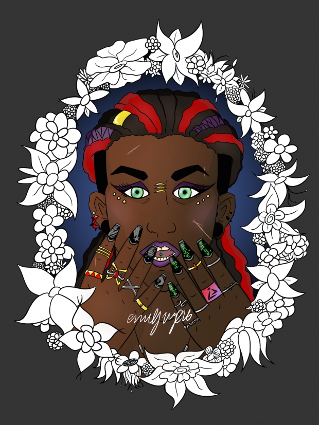
I decided to finish this one for my 50th submission!
Ultimately I left the flowers blank because I didn't want there to be too many distracting colors in the picture, since Klye herself is already kind of bright. I'm not sure what I think of my shading, I had a lot of trouble trying to figure out what was best to do for some of the bigger spaces. I just like the blue background the most
Tell me what you think!!
Art/character c) me! Please don't steal!


 Klye floral colored


