I guess the first thing to discuss is the old picture. Yay old critique time.
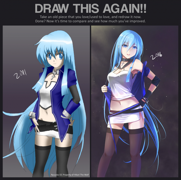
The anatomy part is good for comic/manga style. I'm surprised myself as I was checking the measurements(PS comes with a handy measuring tool). I remember as a digital drawing trick, I lowered the opacity of the line art so that it appears thinner and blends with the base colors better. Bad decision. If you look closely, the colored edges look jagged and "jittery". While the line art itself is actually clean, the hair lines are lazy, the front hair locks are wrong, and the clothes are positioned bad. The base colors are good, maybe the purple-ish hue isn't really matching but that isn't the concern. The shading is where the issue is. Some of the shading is pretty good like the arms. Other parts are bad, the legs. The worse part about the shading is the coloring of the shading. I used to adjust the shading by lowering the brightness. Also, in some areas, the shadows are lacking and missing but other than that, it is properly casted, mostly. Lastly, all of the shadows lack depth. The highlights are better, which was actually drawn in and not by adjusting. The metallic look is entry level, so no big deal there. The gradients are smooth. Even with all of the negatives, I'm still proud of the old illustration. With the skill level at that time and limitations of the computer, I gave it my best shot (in fact, it was for another contest, kek). I don't feel bad nor embarrassed for drawing this at all.
Thoughts on current drawing.
Better shading, more colors, lineart, dynamics, hair proportions, and way more detail. What's new is color temperature tinting, reflective shading, sharp inking, line art weight variance, line art color blending, and Overlay. I wanted to stick with a similar pose to reflect upon the old illustration. What is more important is that the style is unchanged(lineart + soft freestyle on-layer) but yet upgraded. I felt that if I changed the style, it would defeat the purpose of this exercise as really the point of it is to show your improvement and not just creating an illustration that just looks better and in the same ballpark of the original(IMO).
Also, I'll be putting up a regular fan art of the new one with full background.
What I've learned (digital illustrations)
-Don't let the program paint for you.
-Remember your light values.
-Start with a neutral background color.
-Take your time, Even if you're near completion.
-Look at your art at different angles.
-Experiment frequently.
-If you don't like how the art is going, stop and save it for later.
-Every style has it's own unique way of evolving. So there's no "1 style above the rest"
TL:DR First one still rocks, second one even better...I think.
Ryuuska OC is a property of Hikari The Wolf.
Thanks for letting me redraw her.
As always:
Questions, Comments, Rants, Critiques, Criticism, Complaints, Nitpicks, Tips, Feedback, Votes are Welcome. So say what you really want to say, Even if it's negative. Thank You.


 Ryuuska Redraw


