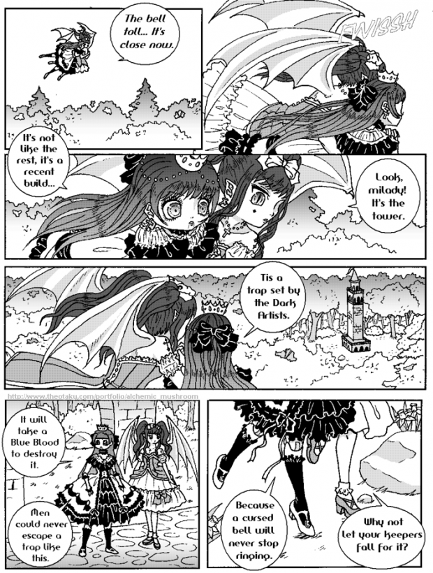
even though natalya's dress is grey and black, for screen toning the comic i left it just white and black because her hair is already toned. too much screen tones makes it hard for me to distinguish characters.
what do you think? is there anything i could improve on? i'd like to hear as much critique as possible since i'll be sending sample comics to publishers soon. please tell me what and why. in other words, comments like "you should work on hair" are vague and not much help. explain to me whats wrong with the hair and how i could fix it. just an example but you get my point.![]()
think everything looks good? tell me why anyways and it will give me a better understanding of my own artistic ability, okie dokie?


 The Petite Affairs of Natalya!


