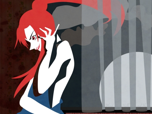
I must be losing my mind, really. This and my last wallpaper have been dark and gloomy, but I promise that's going to change. It's not really my style, I usually like brighter and happier images :) I wanted to illustrate White Zombie's song really badly, so I went through my collection of screencaps from various anime series and came across this creepy image of Layla during her performance in the "Salome in Vegas" show. By the way, this is the illustration for the "Miss September Mix" version, which is slower and more sinister than the base song.
Anyway, the wall was born solely as a contest entry on Minitokyo. The theme was "dark wallpaper, inside or outside scenery, with blood". Why blood? I suck at making blood ![]() Plus I think most bloody walls are emo *runs away from emo people* I don't know why, but I find blood unappealing. I mean, anyone can make a bloody wall if they want to, there's not much to it ._. Enough with the ranting and let's get to the technical stuff!
Plus I think most bloody walls are emo *runs away from emo people* I don't know why, but I find blood unappealing. I mean, anyone can make a bloody wall if they want to, there's not much to it ._. Enough with the ranting and let's get to the technical stuff!
I originally vectored the Layla screenshot a few months ago (don't remember exactly WHEN but it was ages ago!), using only raster layers. I wasn't happy with it because it looked crappy so I vectored it again, this time using shape layers (easier to manipulate). I do find vectoring with shape layers easier than vectoring with stroke path; even though it's more time-consuming, the results are better (I've picked up this method since a week or so). At first I was going to put some lyrics from the song on her skin with different fonts, but it didn't look good so it got the big 'delete'.
The curtain is made by me alone! *is proud of silly-looking curtain* The texture is from DA! Desktop Anime and the wallpaper pattern is from Colorfilter.
That's all there is to this wall. Oh, and the blobs in the sky are clouds. And that big white ball is the Moon. And yeah, Layla looks less creepy because she isn't looking at you XD (not like in the screenshot!) I hope you like it, please drop a line if you do/don't! Opinions are greatly appreciated ![]()


 Blood, Milk And Sky


