Looks best with widescreen resolution.
X-posted to animepaper.net
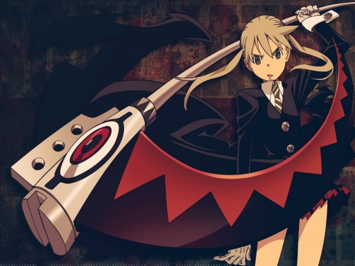
Danger: Maka looks annoyed while wielding a sharp object.
This one I went in with a clear idea of what I wanted it to look like. It doesn't look like that at all.
I wanted to go for a more modern, crisp look: vector arrows, urban symbols, all that fun stuff. But it was pulling me in another direction, back to the grunge look that I love so much.
And this took surprisingly long. I went through several different textures before I decided on one, and had a terrible tie trying to decide on what to fill the epty space with, so it took me around 3 hours.
If there's anything that I really came out liking in this wallpaper, it's the color. Especially in darker wallpapers, I can be terribly picky about it.
Lovely vector: viesiu.animepaper.net
Textures: AsunderStock.deviantart.com


 Danger


