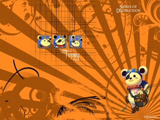
Next is our bear (though don't call him a bear): Toppy.
I will admit, this was probably the most difficult in the series for me to make. Especially considering I really didn't know for certain what I wanted to do - it was all really trial and error for this one. But, I think it turned out quite well.
You'll probably notice that I had to change the basic layout (the lettering, and those three little pictures) because of how short Toppy is. (Poor Toppy, you can just hear the short jokes in the background.) I felt it looked better like this. I've been in the process of re-watching Sands of Destruction, so I should have the rest in this series up in no time.
Credits:
Image
Second Image
Sparkling Light Brushes
Rising Sun Brushes
Grunge Swirl Brushes
Straight Blurred Line Brushes
Circles Brushes
Spiky Swirl Brushes
Swirl Parts Brushes
Twirl Brushes
Texture
Fonts used: (from dafont) 'A Charming Font' and 'Ringbearer'


 Orange


