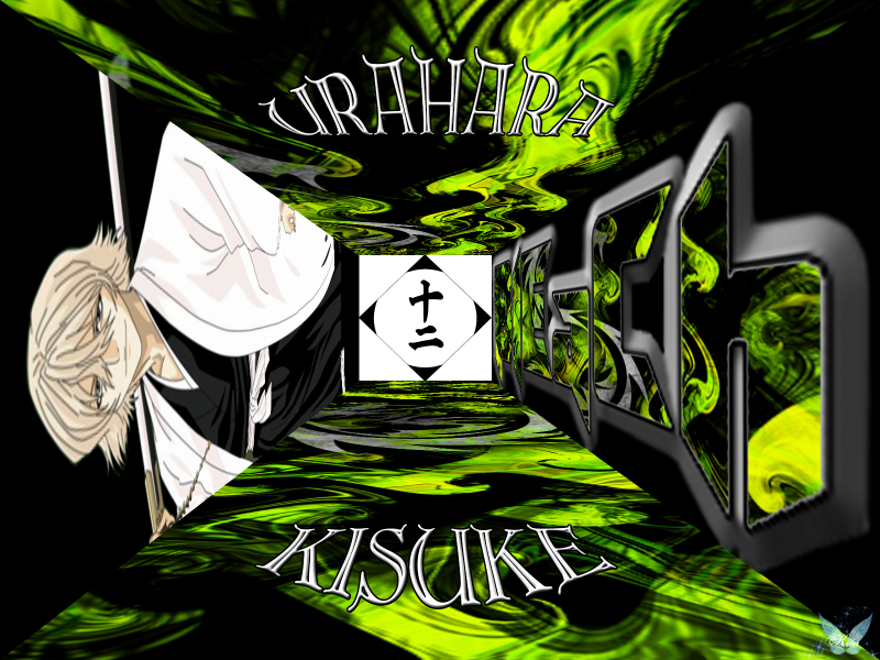
Well? I am not too sure what to say about this wallie... Well besides... It is GREEN... lol. It's a new technique I am working with/trying to learn in PS6 called Vanishing Point. I like it and you can do A LOT of cool things with it. I was a little disappointed though when I placed the Bleach Font on there. It distorted the edges; inside and out. I was able to fix the outer edge, but when I went to fix the inner... *sighs* All the colors started to bleed together.
Anywho... Please comment and let me know what you think. Maybe even some pointers if you know how to use Vanishing Point... Well at least in the manner I am trying to use it... heehee.
Faves, Comments and Votes are always appreciated...
See ya around TheO my friend...
Kita
Oh for sources?
Image of Kisuke: PlanetRender (I think???)
Background: By Kitabug69
Font: Dafont.com
Brushes: PS6
Bleach Text: Kitabug69
Division Image: Kitabug69 It's really a brush set I made with all 13 Divisions
Program: Adobe PS6
*waves* Byebye ![]()


 Bleach 567


