Hello and welcome to my little musing page.
I'll be using this as more explanation on my art.
If you want to see more of my art please visit http://tavisharts.kamiki.net
Hello and welcome to my little musing page.
I'll be using this as more explanation on my art.
If you want to see more of my art please visit http://tavisharts.kamiki.net
I was wondering if anyone has already attempted a fashion through the ages "comic" or world here on the otaku. Or if anyone would find it useful if someone did.
I studied theater and art history involving architecture, art and costume in college so I rather like the subject and I have lots of reference.
I could also do the same for architecture if anyone is also that interested in that.
I just want to know if I should before I start going nuts studying and constructing it.
XD After a few comments about the small size I like to post in I decided I would show a few detailed shots of some of my art.
For the most part I post small versions (and intentionally use jpg not at maximum settings) as an attempt to protect it. I also double sign most of my art (once with my username and once with my real name). I have seen people watermark the middle of their art to protect it but I don't really want to go to that extreme yet.
The reasons for this is that people have stolen my art in the past. Most of the time it happens its actually people trying to enter them into contests to win prizes or try to set up shops on avatar sites in order to scam people. I haven't heard of anyone trying to sell prints but the small size is to deter people from that. It has happened to other artists I have talked to.
This doesn't mean that you can never see a larger size. You have to ask me for it.
As a warning.. I do work on a massive scale. It's because I sell prints of my art so it makes for a cleaner and nicer print.
On to the art!!
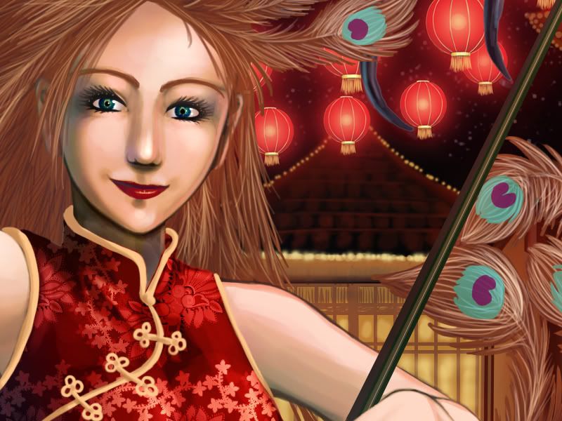
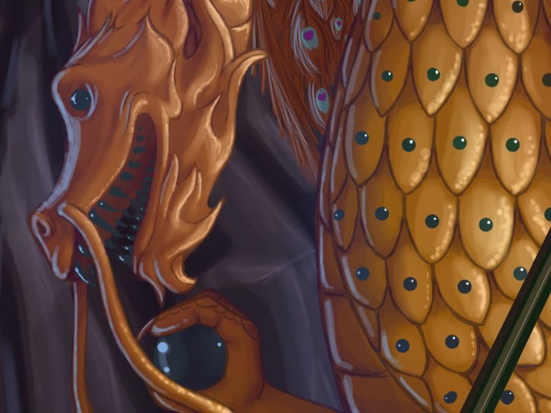
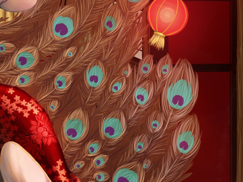
First one:
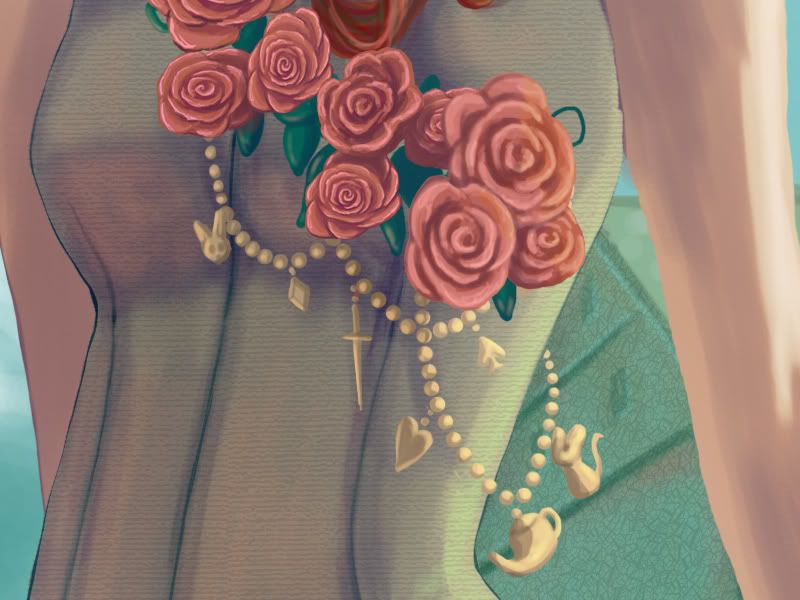
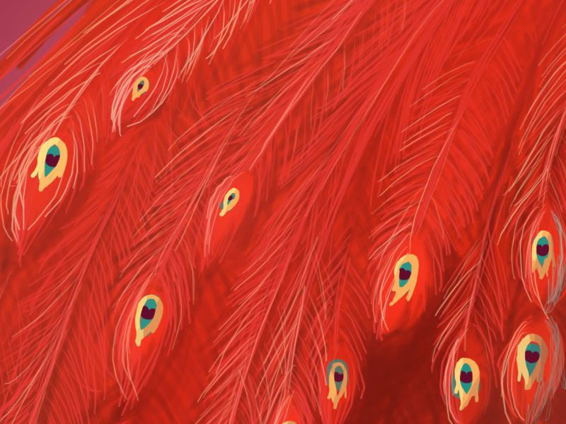
Asian peacock: new years.
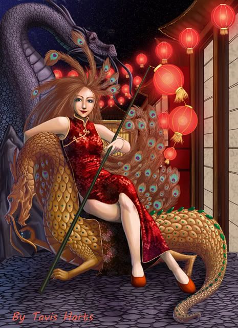
facecloseup
dragon close up
feather Close up
As you can tell she was one insanely huge picture. XD And I will add detail upon detail.
If you were wondering why I didn't add a lot of shading to the yellow part of her outfit its because it started to disappear the thinner it got. So I left it a bit brighter to allow it to be seen in the image overall.
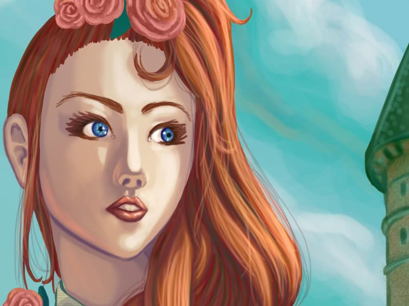
Ashling
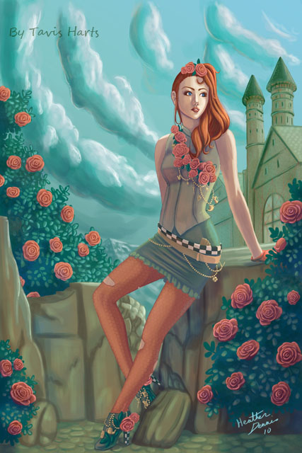
Face
vest
She was more of a test of coloring like I was using oil pastels. The idea came from using open canvas a lot.
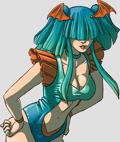
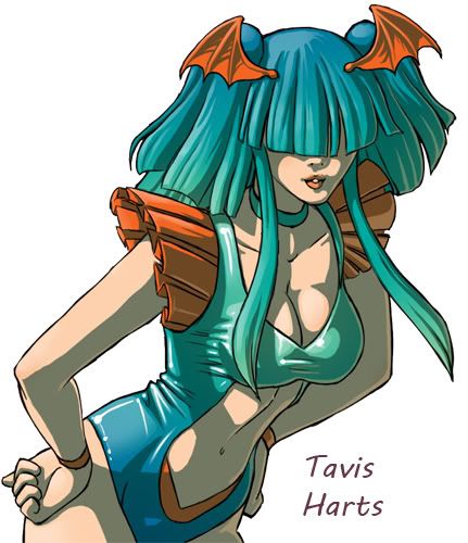
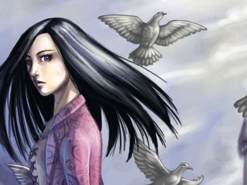
Of bats and birds
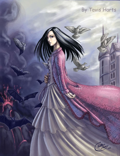
face and birds
You will notice on a few of the close ups you can still see the pencil marks. I actually do that intentionally because I like the noise effect they have when you view the work as a whole. :3 I will also do this with scans of my inked works. So sometimes the lines won't be smooth.
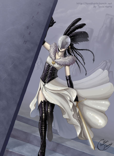
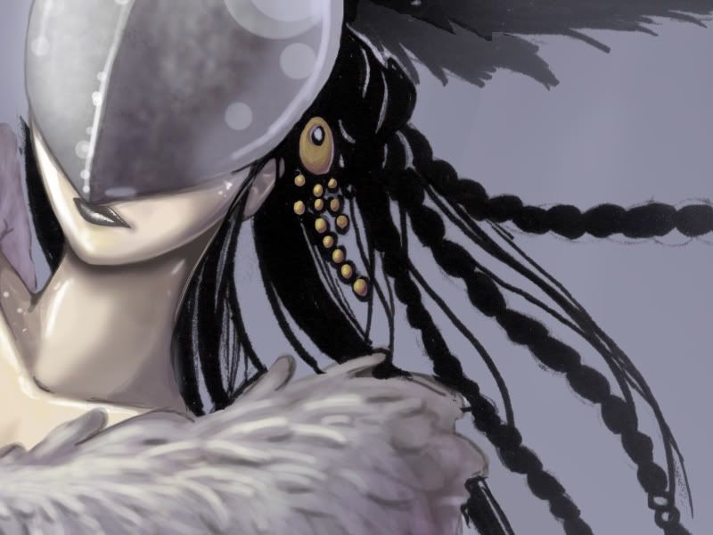
Dark valkyrie
Asian peacock
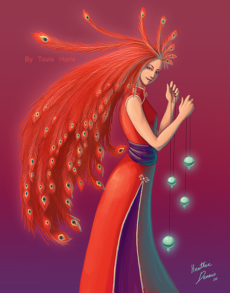
face
feathers
This one was intentionally made messy but you can't tell in the small version.
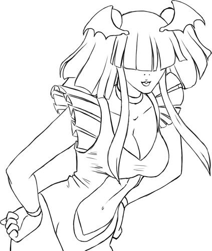
I have many techniques for coloring but one that a lot of you probably noticed has been my cellshading used for knuffels. This is actually a fun and easy coloring style that you can do to.
Now, I generally recommend doing stuff in real media first. The real media equivalent of my cell shading is actually heavy inking. 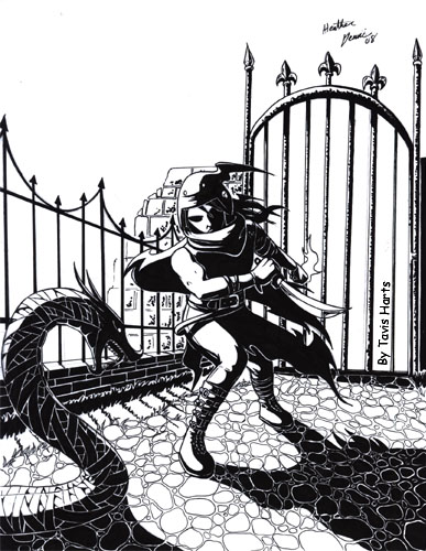
You have to really embrace shadows and adding a lot of them. However, if you aren't really keen on doing shadows this might be a good introduction to dramatic shadows.
The obvious first is the lineart.
At this point I add in the base colors
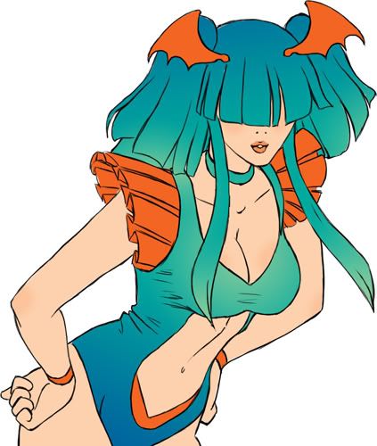
You get to add in a lot of the gradients and makeup in this stage.
This also allows you to see if the colors work well together.
Now on a new layer you are going to choose a nice dark color (in this case I chose a really really dark green) and you will put that green absolutely everywhere you believe a shadow might be. This is going to be a flat color and won't look overly great but trust me, this will make life easier later. This is also why its very similar to inking.
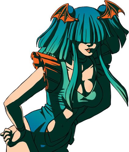
Because this is on its own layer you have a lot of freedom with it. If you want a lot of dramatic shadows you can just lighten the layer just a bit. (in this case about 80%)
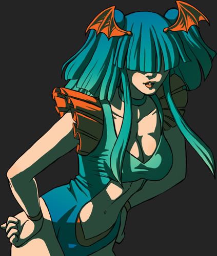
If you aren't after as much drama you can instead lighten it up more (in this example about 20%)
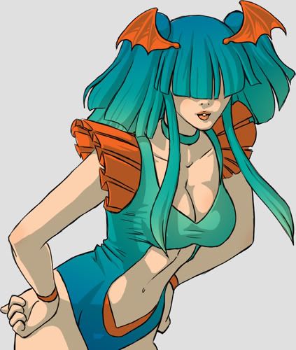
I tend to prefer about the middle of the scale.
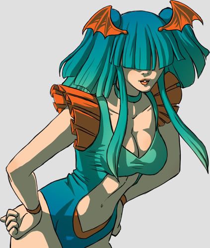
At this point I wanted to give the cloths a bit of a shiny to really define the fabric. You can also use this for shine on the eyes. Basically on a new layer you add a bit of flair.
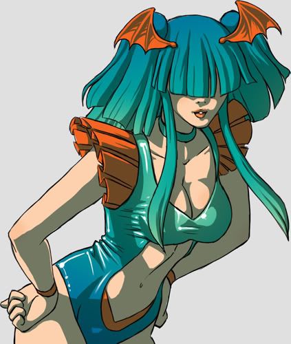
Now for highlighting. At this point you can repeat what you did for the shadows but I prefer to use an airbrush technique to soften up the light a bit.
What you want to do is on a new layer get the lasso tool and select all the areas you want lighlights to appear. You are going to get a soft brush and put the coloring to low (like 12% or less) You want to lightly go over the areas you want to lighten up. Even sometimes a few times to get it about how you want it.
At this point you probably think you are done. However I like to add something else for added depth. An interesting fact about light is that in a lot of situations theres a backlight caused by a bounce back from the original light on other objects around the character. Also sometimes theres just a second lightsource in the area. So you can have fun with this and add more color to your picture.
For this I use the same technique for making the shadows however its a bright color.
And viola.
I tend to do a lot of coloring. So I wanted to share a bit on my philosophy on coloring.
I don't use black for shadows 90% of the time.
The reason for this is that it desaturated a work. Also it's easier to convey a time of day as well as bring forth a color scheme if you actually choose a color to shade with.
To kind of give you an example
Green shadow
Red shadow
Orange shadow
And my favorite color to use as a shadow: purple
Now this isn't to say I don't use black as a shadow. Its just that the color scheme HAS to have black/gray as a main color before you see me do it.
Example
Now even in this one blue is a main color in the shadow. You just get to see more grays in the shadows because the color scheme is actually gray, blue and yellow.
The color scheme is actually more important than the actual color a person/thing is suppose to be.
I have absolutely no qualms about making a person green or purple if thats part of the color scheme.
example: warning(blood/violence)
As you can see here the color scheme is green, purple and brown. As you can see everything there (even the "blue" in the picture) has purple and green in it. The blood is purple because red would break the color scheme. I actually refuse to use a color thats outside my chosen pallet.
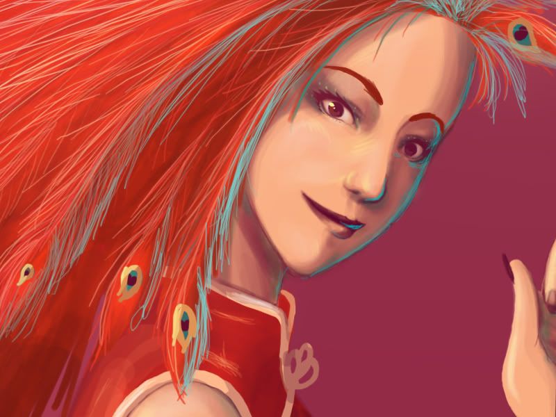
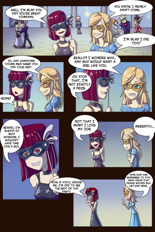
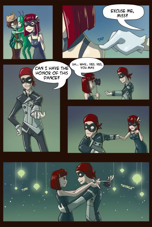
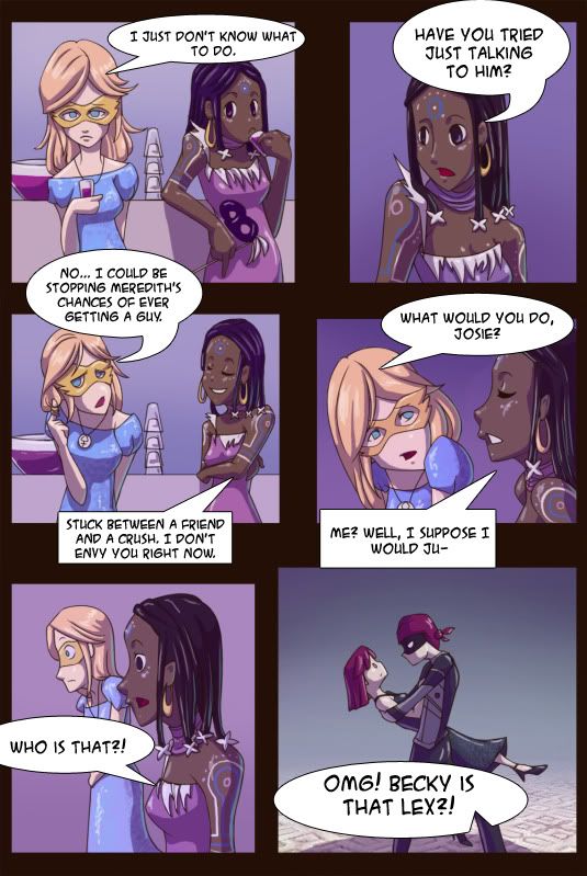
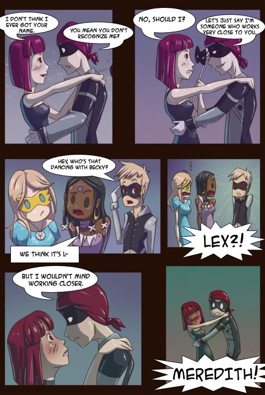
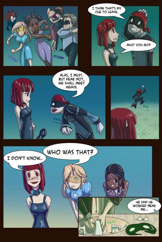
A really good example of how little I tend to heed the true coloring for the sake of the color scheme can be seen in a collaboration I did.
I was chosen as the colorist for a mini comic on gaia
Story written by: Draike woode
art by: the frogger
Inking by: plushie heartless
coloring by : me
page5
page 6
page 7
page 8
page9
As you can see at times Meredith's (the red head) hair goes from red to pure purple in some panels. Also their skin will sometimes be purple or green depending on the lighting. Every page and almost every panel they are colored differently.
I recommend this insane coloring to others as well. In truth when you color the audience is in a state of suspended disbelief. So you can make things all sorts of colors and the viewer won't have a problem with it. Its really a lot of fun.
Theres also a lot of psychology that goes on with how you can get your viewers to see a purple person as being normal and completely healthy.
You can read a little bit of it here.
http://www.designmatrix.com/pl/cyberpl/cic.html
The perception is always more important than the actual color. So don't be afraid to try some crazy colors.
You are going to see a lot of knuffels from me. I'm on a mission to try to draw all the ones I own. This isn't a particularly easy task due to the fact that new ones come out all the time.
Many people don't know what they are so I wanted to go into a bit of explanation to clear up any confusion. The long and short of it is that they are an elemental pet.
They originally started off on gaia and after it became really big it gained its own website. You can get one too on www.kofk.de
Knuffels evolve so the more you work with them the fancier they become. Also they are planning a battle system where the knuffels give you bonuses to stats.
This is one of the knuffels from start to finish.


I generally only draw a knuffel when they reach level 50+ (the 3rd stage)
I try to be as accurate to the knuffel as I can.
Example:

I hope this clears up things.
If anyone here is on kofk feel free to give me a poke. :).
End