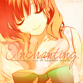
:) Okies, so here's the entry for the editing challenge...I figure for this, I just do what I normally do. XD My best to make a scan look better! So yeah. Lol.
I used this scan. It was really light and slightly blurry...and so I improved it a lot. :) By sharpening, enhancing the saturation, adding gradients/lighting, and a little texture. And the bokeh brushes, too. I erased the texture from the top part...so it's mostly just on the bottom by the book. Don't know. I guess I just wanted to focus on the book like having it seem...enchanting with the texture and bokeh lol...don't ask. XD I thought it looked cool.
HERE is my other version...I like this one, too. It's more vibrant. I wasn't sure which to upload, so yeah. If you like this one more, I will switch it out. :D Thanks. Enjoy~


 enchanting.


