I've missed out on a lot of challenges lately, but I'm just making it in time for this one! Yay!
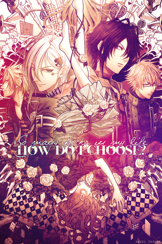
I used this scan. Sharpened, added layers of gradients/lighting, changed the colors/saturation so it was mostly beige and purple...and then did the text. :) At first I wasn't going to have typography on this one, buuuuut it turned out well.
Enjoy~


 so many paths.


