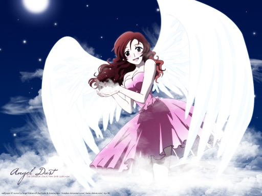
Well, I must say that this wallpaper took a lot of work! And I also must say that it will probably for nothing! Seeing as Chance Pop Session is quite unknown...^^; So yeah, this is Akari from Chance Pop (or Triangle) Session. It's a very good anime so I suggest you watch it! Now then, this is only my THIRD vector so please be nice. I'm amazed that it's so much better than my first two though! I submitted it on AP as stand-alone so hopefully it'll be accepted. I'm always fearing whether my things will be accepted there or not...
The original scan I vectored is this one:
http://www.animepaper.net/gallery/scans/Chance-Pop-Session/item52656/
It was quite hard for me to do...I'd go into the details, but I already did for the description of it as a scan (on AP)...and I'd rather not mention it all again here! Plus, it took a long time to describe. .(-c-). I'll sum it up here quickly though: it took over 10 hours, 100 shape layers, 10 normal layers (outlines), she's an amputee, I hated doing her hair and dress, and, again, it was hard for me. Yes, that's just for the vector of Akari.
As for the wallpaper itself...the background and all, I had this idea to have her on the clouds and holding stardust! I don't know why, but that's just how I imagined her being. So I used brushwork, gradients, a circle for the moon...added glows. I had fun with the little stars and glowing things all around! I think it kind of looks like she's holding stardust now, right? I hope so. I'm also really hoping that she looks ok...and that this overall wallpaper looks ok, too!! It took a lot of time and work, and I just don't want this to go completely unnoticed. It may suck, and it isn't my usual texture-y wallpapers...but it's still fine, right? I keep getting told that my wallpapers need variation and that they're all really similar! I have a feeling this one is, too...sorry.
Thanks for taking the time to look and read this (if you did). Please enjoy!!
P.S. This time, instead of just changing the image size from 1600x1200 to 1280x1024 and ending up with skewed proportions, I actually cropped it to fit the size...so some is cut of (SOME) in the 1280x1024, but it looks clearer and non-distorted this time!


 Angel Dust


