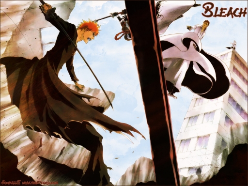
I don't even follow Bleach so I couldn't tell you why I chose to play with the scan that I got from here: click meh Perhaps it's because the first time I saw it, I was struck by how bland the colors are.
So I acquired the scan and then got the bright idea of making a background for every single size we offer here at theOatku. Since the scan in question wasn't quite a full 1920 in width, that meant I had to clone the left side and extend it over.
Once I finished that I worked in some textures that I got from spiritcoda. Along with several layers of brushes too. I didn't like how washed out the sky was in the original scan so I put in a layer of cloud brushes for the sky.
Then since I don't like the placement and font for the logo, I removed it and put something a bit more simple in the top right hand corner. I picked up the font for that from daFont. Yes it's supposed to be a font that matches Wolfs Rain. :p
Time spent: two hours. And of course widescreen will be the best. ;)


 Scorched


