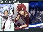
The 7th placer is AnnaKanda
My comment: The whole wallpaper is actually good. Though it was very simple. I'm sure that you put some effort in it, but it needs more. It's a little too plain. The text is also a bit too...... plain. Try using some simpler fonts like Sans Serif and add various effects. Fancy fonts don't fit in a "plain and simple" wallpaper like this one.
So the thing is, everything is plain. Too plain. Try adding lighting, typography, effects, more brushwork and more effort. when making something, you must have the correct kind of inspiration, resources, you must be willing to spend a lot of time and patience. And also, a good wallpaper is something like this one. But if you are able to apply those that I told you, then you might be able to make an "awesome" or "great" wallpaper. Try and read tutorials. Or practice more
I'm not asking you to apply those now because I now this wallpaper is a transition of your old style. But, progress slowly, progress more.
Rating:
Difference in style------------ 16%
Creativity--------------------- 16%
Originality-------------------- 16%
Beauty------------------------- 17%
Clearness---------------------- 26%
Total-------------------------- 91%
Congratulations!
