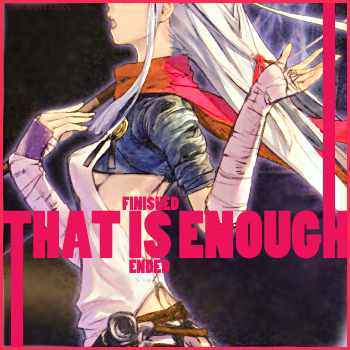
My word, another card from me! Ahaha.
Well as you can see, I increased the saturation a fair bit. I also changed the colours a little and sharpened the image. I blurred the background a little, as it looked really grainy. By this point the image had a pink tint to it, so I went with that for the text.
Thanks for looking ^^


 No More


