View Alternative Versions Here: http://kuryuki.tumblr.com/post/18888268547
No video this time, Progress shots: http://kuryuki.tumblr.com/post/18889696582
(I took a lot more since I need it for my sketchbook afterwards xD)
(the original's pretty big)
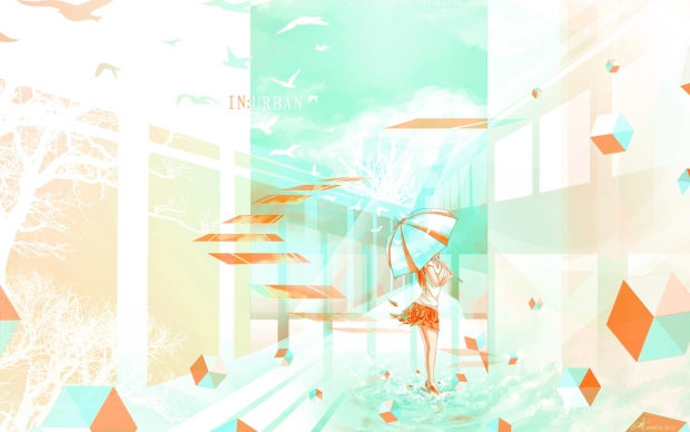
Art Project made to be Printed out as big as possible for my school's Thursday Open House xD (everyone in the class was required to make a new project for the day, I chose digital simply because it's much much faster, or I won't be able to make the deadline)
Title: IN:Urban
It's not simply because I liked how urban looked (:
It's placed on the separation between the white and the cyan indicating that the white parts are in-urban (not urban) while as a whole phrase, indicating the whole piece is in urban (inside urbanization)
I wanted to focus on the influence human have on change in their environment.
That..is obviously something that came out of no where after I started this though.
At first, I simply wanted to draw a girl with umbrella in an abstract setting with birds, buildings and cubes. With the colour scheme cyan and orange xD
The lovely tree silhouettes on the left are courtesies of http://arsgrafik.deviantart.com/
The cubes were inspired from this illustration I saw done by Mel Bochner xD
Girl's pose's reference image courtesy of http://sinned-angel-stock.deviantart.com/


 .:IN:Urban:.


