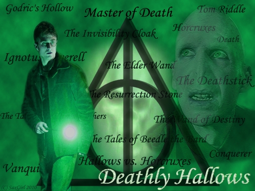
This is a challenge entry for the 'The hardest wallpaper I ever made...' challenge, hosted by josephine12cute ^^
First off, I hope this looks like I put a lot of effort into it, cause I feel like I sure did![]()
How this wallpaper came about:
I was reading HP and the Deathly Hallows, again, so that was my first inspiration. Then I was also reading stuff about HP spells and artefacts on Wikipedia (don't ask why, I don't even rememberXD) and then I saw this picture of the Deathly Hallows sign:3 That's when I really knew what I was going to do^^ Then I went looking for the right pictures of HP and Voldemort (the second one was hard to findXD) and I managed to find good quality pictures, so that was great^^
Editing and finishing touches:
- Extracting the pictures from their original images
- I used a texture on Voldemort
- Texture on 'Deathy Hallows' (text consists of two layers)
- Various effects on DH sign, including Drop shadow and a lighting effect
- Tried a veriety of filters and textures on DH sign, but eventually made some kinda texture thing using the dodge tool:3
- Some touching up on HP (including some blurring here and there) + hue/saturation - I changed the picture to a more greenish hue (it was blue at first). Initially, I had a green background and tried to fit Harry's colours to those of the bg, but in the end I adapted the bg to HP's colours:3
- Some touching up on Voldemort
- Big change on Dark Mark (which came rather as an afterthought, but took a lot of time to get it rightXD) - hue/saturation, colour overlay, creating more depth using burn tool (image wasn't very 'visible' in the general composition)
The hardest things:
- Finding just the right pictures
- The composition of all the different pieces of text. First I typed all the words and phrases that, in my opinion, link directly to the DH, and then I had to put them into appropriate positionsXD At the end of the process, I also changed the size of some words, made them somewhat bigger or smaller. And after some contemplation, I slightly changed the colour to a really dark shade of green in stead of black, to make them blend in a bit better with the rest:3(Note: the positioning and size of most words is significant and symbolic in a way)
- Keeping all the images visible, and all the text readable (I made HP slightly less opaque so you can read ALL the text:3)
Unusual for me:
- I started out making the 1920x1200 resolution wallie (that was part of the challenge, so I figured I'd better start off by making that one:P)
- I used lots of textures (I NEVER do!)
- I made use of opacity a couple of times
- I used several filters (again, I never do that!)
- I messed around a lot with hue/saturation/colour overlays etc.
- Also, I placed some effects on the DH sign; I didn't even know they were available in PS before I made this wallie!xD
Done in: PS 6.0, with pen tablet
Time taken: probably about 6-7 hours in all
Original pictures:
Harry Potter
Voldemort
Deathly Hallows sign
Dark Mark
Brushes and textures all standard in PS
Dedicated to: Sage of Magic, because I haven't dedicated anything to her in a loooong time;^; And I know she likes HP too!^___^ So I hope you like this as well Sage-chan, even though it's a little gloomy x)
Enjoy!^^
~SaxGirl~


 Deathly Hallows


