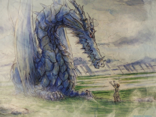
Well, I wanted to use this [scan] but the colours were really washed out and pale. I wanted to make them bolder. I hope you can see how much I changed them!
I duplicated the layer, added an overlay of blue to the dragon, and used some wispy smoke brushes round the edges to look like mist. I played with the colours and saturation a little, then added a paper texture. I've really over-used that texture recently XD
Constructive criticism always appreciated ^^
Dedicated to Dark Flame 3479 - just to say thanks for the lovely icons <3


 Earthsea


